Gradients are everywhere right now. From tech branding to UI packs, they have become a familiar shorthand for modernity, motion, and innovation. But long before gradients became a default feature of contemporary design, they were already deeply embedded in visual culture. In Japan, gradients are not decorative afterthoughts. They are structural, emotional, and often symbolic.


One of the earliest and most influential examples is Bokashi, a traditional technique used in Japanese woodblock printing. Bokashi creates graduated colour transitions by carefully applying ink to a woodblock and manipulating its distribution by hand. The result is never perfectly uniform. Colours fade, bleed, and soften into one another, creating atmosphere, depth, and a sense of time passing. Emotion sits quietly between tones.
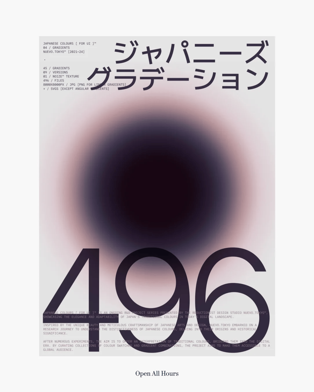
Fast forward to the present day, and this sensitivity to transition still echoes through Japanese graphic design. It’s often defined by contrast. There is a strong sense of hierarchy and structure, allowing dense amounts of information to coexist within a single composition. Simultaneously, gradients introduce a soft, warm counterbalance, often acting as the base on which these complex layouts sit.

Colour plays a central role in this balance. Japanese designers frequently use multiple vibrant tones within one composition. Large fields of colour are broken by a single object, line of text, or graphic mark. Gradients are used as active surfaces that introduce movement and rhythm. They suggest futurism while quietly nodding to tradition, functioning as a contemporary extension of woodblock printing translated into digital form.


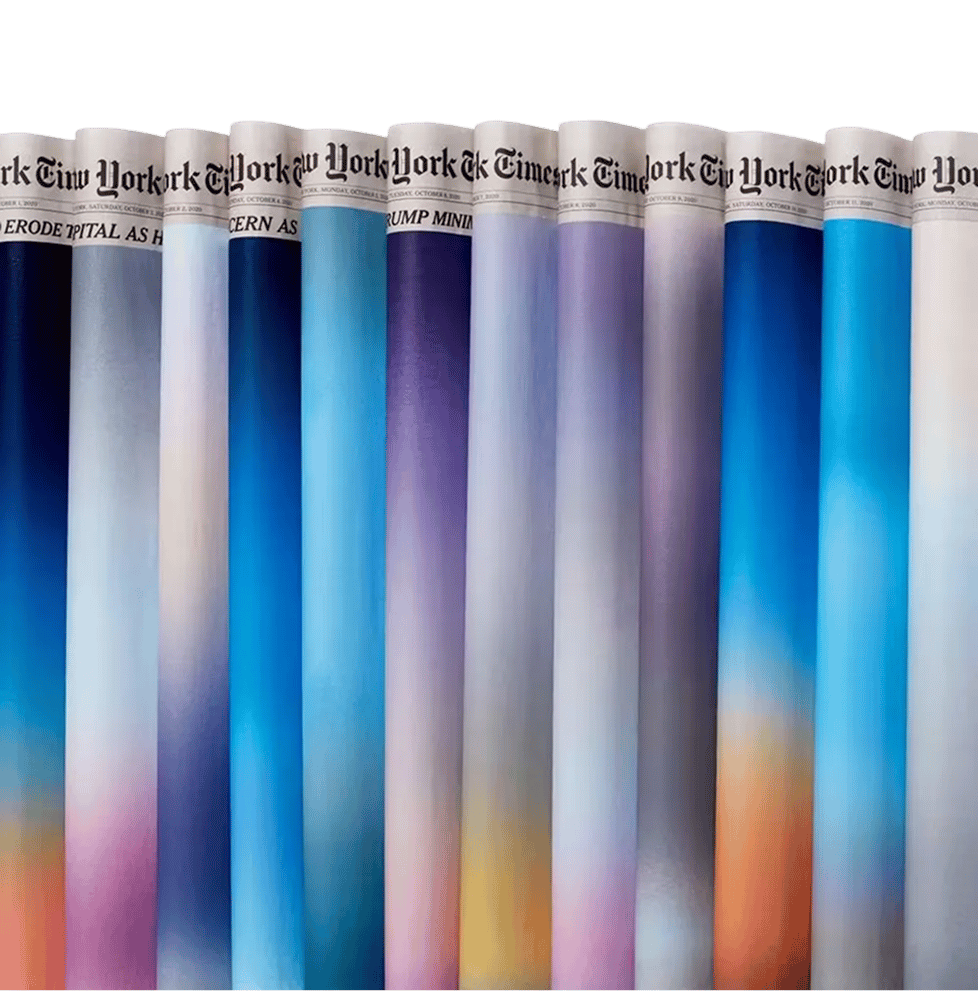
A contemporary expression of this philosophy can be seen in the work of Sho Shibuya, the Brooklyn-based artist and designer known for his daily painted front pages for The New York Times. Each day, Shibuya paints directly over the newspaper, depicting current events through soft gradients of colour. Sometimes these works mark moments of hope. Other times they quietly acknowledge tragedy. With minimal visual language, Shibuya communicates what words often struggle to hold. The gradients do not explain. They create space for reflection.

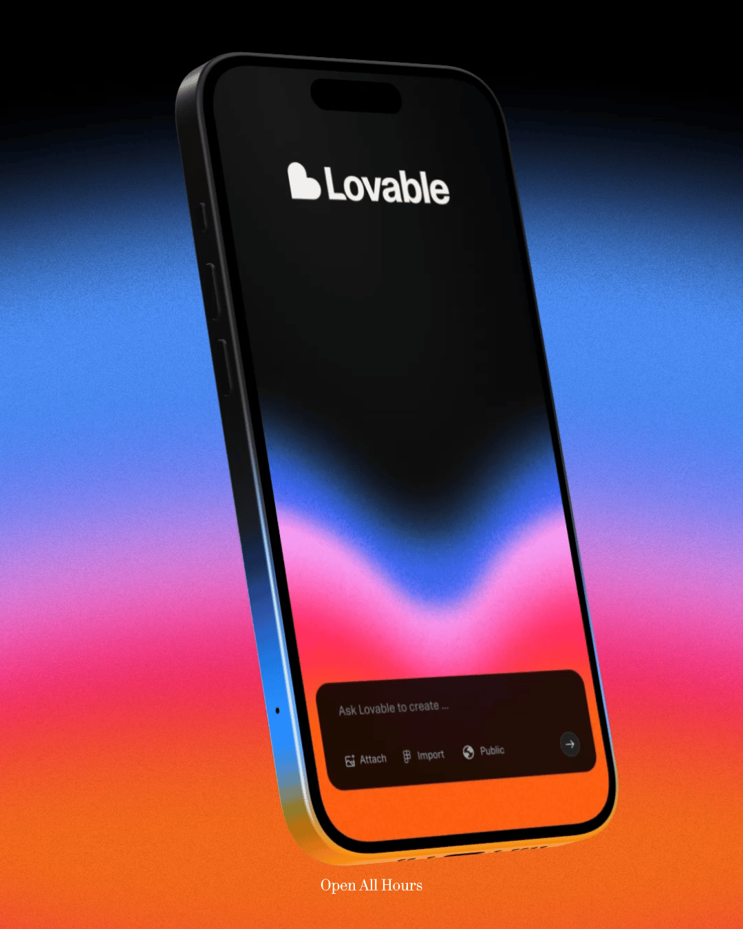
This philosophy has also found its way into contemporary branding. Over the past decade, gradients have evolved from flat digital effects into richer, more tactile systems. Grain, blur, and softness are layered into colour transitions, making them feel human rather than synthetic.
A strong example is the identity for Lovable, designed by Primary Studio under the direction of Nick Pattison. The studio developed a kinetic identity centred on a living heartbeat, using colour and motion to convey warmth and creative energy. Here, gradients form the emotional core of the brand. It is a reminder that gradients are not only aesthetically pleasing, but commercially viable.

But it is worth remembering where this language comes from. Long before gradients were used in branding or positioned as symbols of innovation, they were tools of patience and craft across many visual traditions. In Japan, techniques like bokashi required time, touch, and imperfection. Each transition carried the mark of the maker.
Japanese gradient design still holds onto that philosophy, valuing emotion and storytelling. In a world increasingly obsessed with clarity and speed, gradients remind us that meaning often lives in the in-between.
Shot of the good stuff.


