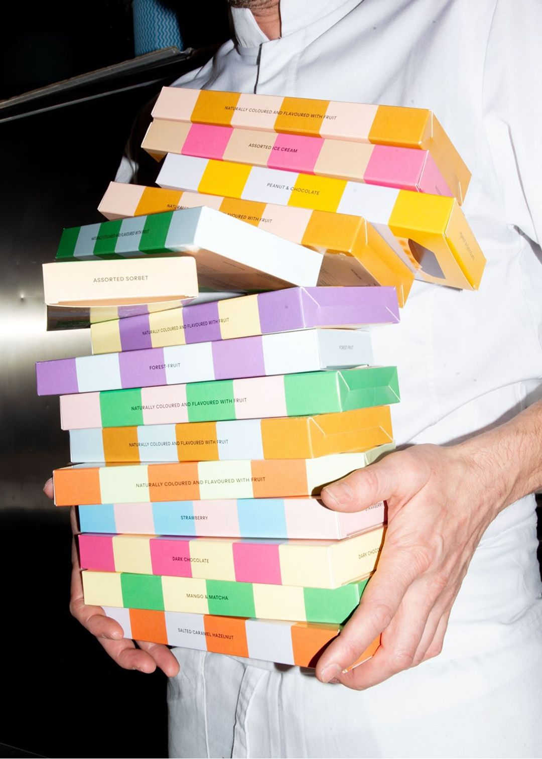
In the West, colour in branding often feels stripped back - chosen to signal energy, luxury, or attention, but without much meaning beyond that. In Japan, colour isn’t just a visual trigger; it’s a cultural language shaped by centuries of craft, nature, and philosophy. Japanese colour theory does not treat hues as isolated tools. Instead, they are part of a living aesthetic tradition where meaning, seasonality, and harmony matter as much as impact.
Traditional Japanese palettes are rooted in the natural world and the rhythm of the seasons. Rather than loud primaries or stark contrasts, their names evoke blossoms, leaves, bark, and sky - usu-midori (pale young leaf green), enji-iro (autumn-leaf burgundy), sakura-iro (cherry-blossom pink). These aren’t arbitrary labels; they are cultural touchpoints that resonate with memory and mood.

Western branding often prioritises bold saturation and high contrast for immediacy and recognition - neon tones or flat primaries designed to cut through. In Japan, colour is more about context than command. Subtle gradations, muted tonality, and elegant pairings reflect principles like wabi-sabi - a reverence for imperfection, subtlety, and transience that flows from art into everyday life. Japanese ceramics, textiles, and architecture have long embraced gentle hues that shift with light and season, rather than scream for attention.
This sensibility matters for brands trying to speak to Japanese audiences. It goes beyond simply localising visuals; it’s about harmonising with a cultural palette that values emotional resonance over visual noise. Western campaigns that simply transplant loud colour schemes into Japanese markets can feel jarring or generic. The Japanese preference leans toward colour that breathes with its environment rather than dominates it.

Even in fashion, Japan shows this depth. Labels like A Bathing Ape and Sacai are celebrated globally not just for design, but for how they place colour within products and narratives - from surfer-inspired camo and muted earth tones to layered, nuanced combinations that tell a story.

In identity work, this offers a useful lesson. Rather than rigidly defining a narrow set of brand colours that must be applied in fixed ways, allowing for flexibility and tonal range can create more expressive, context-sensitive systems - and often a more exciting reception from audiences.

For Western brands hoping to resonate more deeply, the lesson isn’t to abandon bold colour. It’s to think beyond colour as signal and start seeing it as a storytelling tool - a hue that responds to place, to season, and to subtle emotion, not just to attention. That’s the Japanese colour wisdom worth understanding.
Shot of the good stuff.

