

A memorable poster captures your attention instantly. It stands apart from the noise around it, creates a moment of pause, and leaves you with something to remember; a feeling, an idea, or simply the design itself. That kind of impact comes from deliberate choices, not luck.
Posters have always felt like a kind of playground for graphic designers. When I first got into design, they were the format where I experimented the most, tried things I probably wouldn’t have tried anywhere else, and slowly started to build my own visual voice. That’s still true today. Posters remain one of the best places to push ideas, test boundaries, and develop a style.
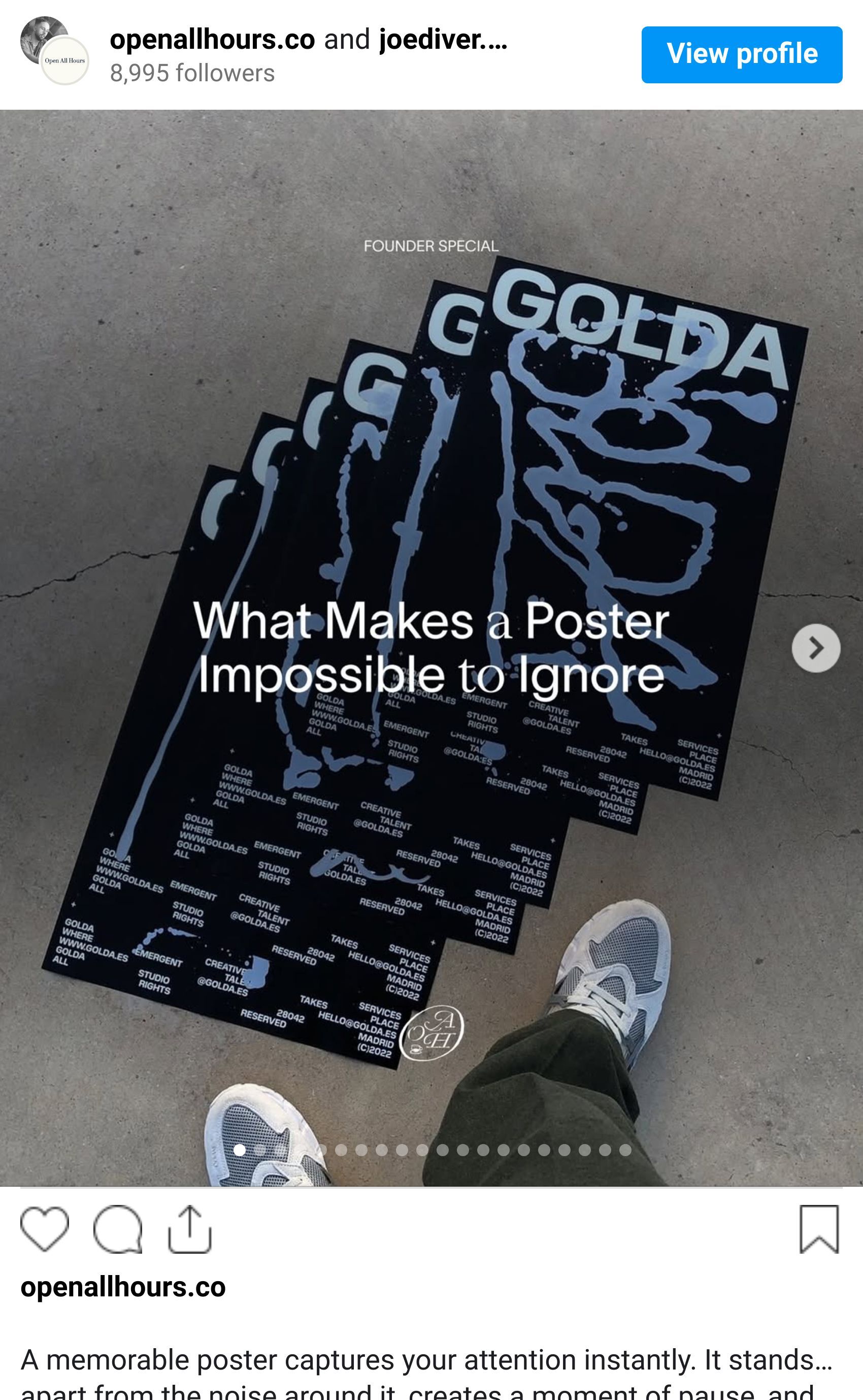
These are the themes that define the posters people remember.


The Power of One Unusual Choice
It’s unrealistic to create something entirely original with every poster. Most visual tricks have been explored by someone, somewhere. But the goal isn’t to reinvent the medium but rather introduce one distinctive element that tilts the poster into new territory.
That might be an unexpected crop, a strange typographic alignment, a palette or gradient that feels slightly “off”, or a visual rhythm that breaks away from the usual. The posters that are hardest to ignore aren’t necessarily wild or chaotic. They simply make a decision most people wouldn’t. They take a small risk. They twist the familiar.
Great poster designers understand that uniqueness comes from subtle deviation. A familiar structure with one confident, unconventional choice.


Communication First
For all the experimentation you can do in a poster, it still has a job: to tell people something. A time, a place, an idea, an invitation. If that message gets lost, the poster hasn’t worked.
Hierarchy, spacing, pacing, and organisation are the invisible backbone here. You’re not just arranging letters and images. You’re guiding a person’s eye through information in a split second, making sure they understand the essential details without needing to think.
But uniqueness and communication aren’t opposites. Often, a distinct visual approach enhances clarity by pointing attention exactly where it needs to go. Take @nachoakanacho, for example, a designer known for beautiful typography, spray paint textures and chrome lettering. His posters grab attention immediately, but the same energy and contrast also direct focus to key information. The style isn’t decoration, but communication through personality.


Repetition
Repetition is a powerful tool because it creates rhythm and recognisability.
You can repeat type layouts, as Leonardo Angelucci does in his Wifi project, turning text into a pattern. You can repeat shapes, colours, or image structures. Or you can take repetition across an entire series instead of a single poster.
Think of Bureau Borsche’s gradient-heavy posters for München Opernfestspiele. They shift hue from piece to piece while maintaining a shared structure. The repetition creates a sense of connection, familiarity, and identity. You recognise the series from footsteps away.
Repetition isn’t laziness, it’s reinforcement. It turns single posters into systems, and systems into something memorable.

Negative space
A poster only works when it gives the viewer room to breathe. Negative space isn’t about leaving things empty. It’s about adding tension, clarity, and intention.
White space creates focus. It frames the important elements. It slows the eye down just enough to understand the message. Crowded posters feel like they’re shouting. Posters with well used negative space feel confident, controlled, and deliberate. They communicate a sense of quality because they aren’t trying too hard.
Great designers understand when to pull back. Often the strength of a poster comes from what you decide not to take away, rather than what you add.

Visual identity
A poster sits in an interesting place within an identity. It isn’t always bound by the same rigidity as packaging or a website. In many cases, it acts as a controlled escape; a place where you can push the identity to its edges without breaking it.
You still operate within the brand’s visual language, but the format gives room to stretch, twist, and exaggerate. Sometimes a sub-identity emerges from this, a flavour or tone that exists specifically for campaigns or events. Done well, this temporary extension can elevate the main brand by showing a more expressive side of it.
Posters reward brands that understand when to loosen the rules slightly.
The best posters blend creativity with clarity. They’re playful enough to stand out, simple enough to communicate instantly, and grounded enough in the brand identity to feel purposeful. They make people stop, look, and understand all in a moment.
Simplicity counts. Restraint counts. But so does personality. A good poster is a balance of the two: a small piece of design where you can experiment, push the boundaries, and try things you wouldn’t get away with elsewhere, while still delivering a message that lands.
When those elements come together, the result is something impossible to ignore.
Shot of the good stuff.
