
Every four years, the world watches a new ball roll out on the biggest stage in sport. For fans, it’s about goals, drama, and the theatre of the World Cup. For designers, it’s something else entirely. The ball becomes a canvas. A mood board. A mirror of the culture it was born into.
Digging through the archives of World Cup ball launches is like flicking through decades of design history. Each one tells you more about where graphic design was at the time than it does about the tournament itself.
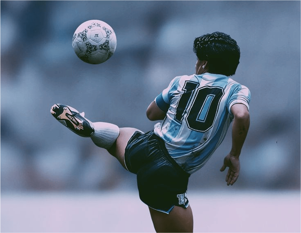
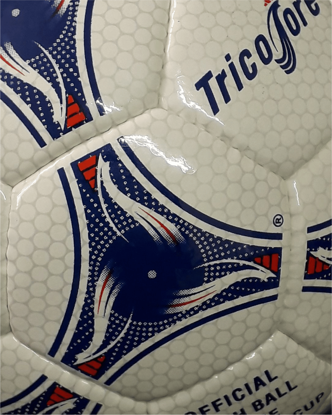

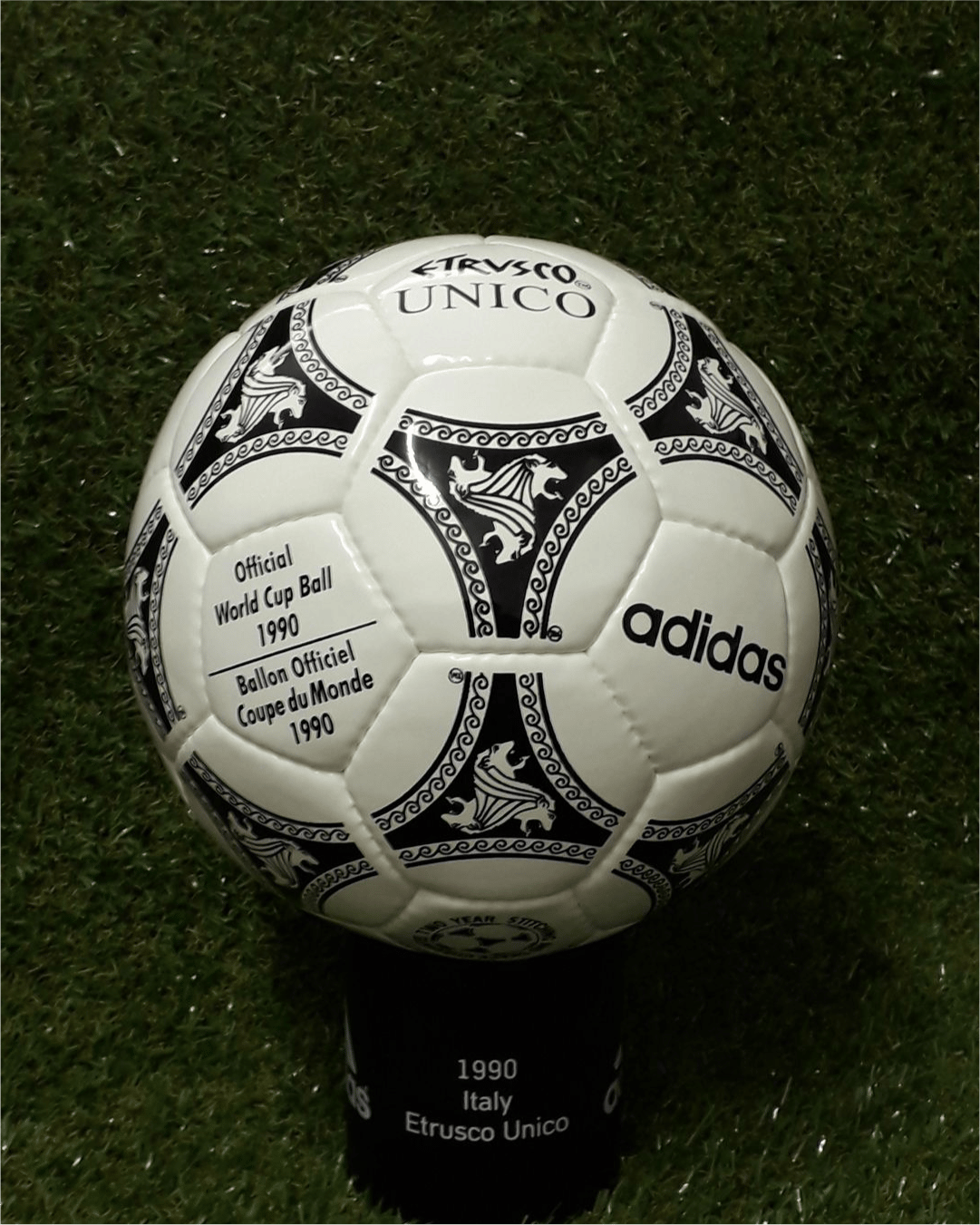
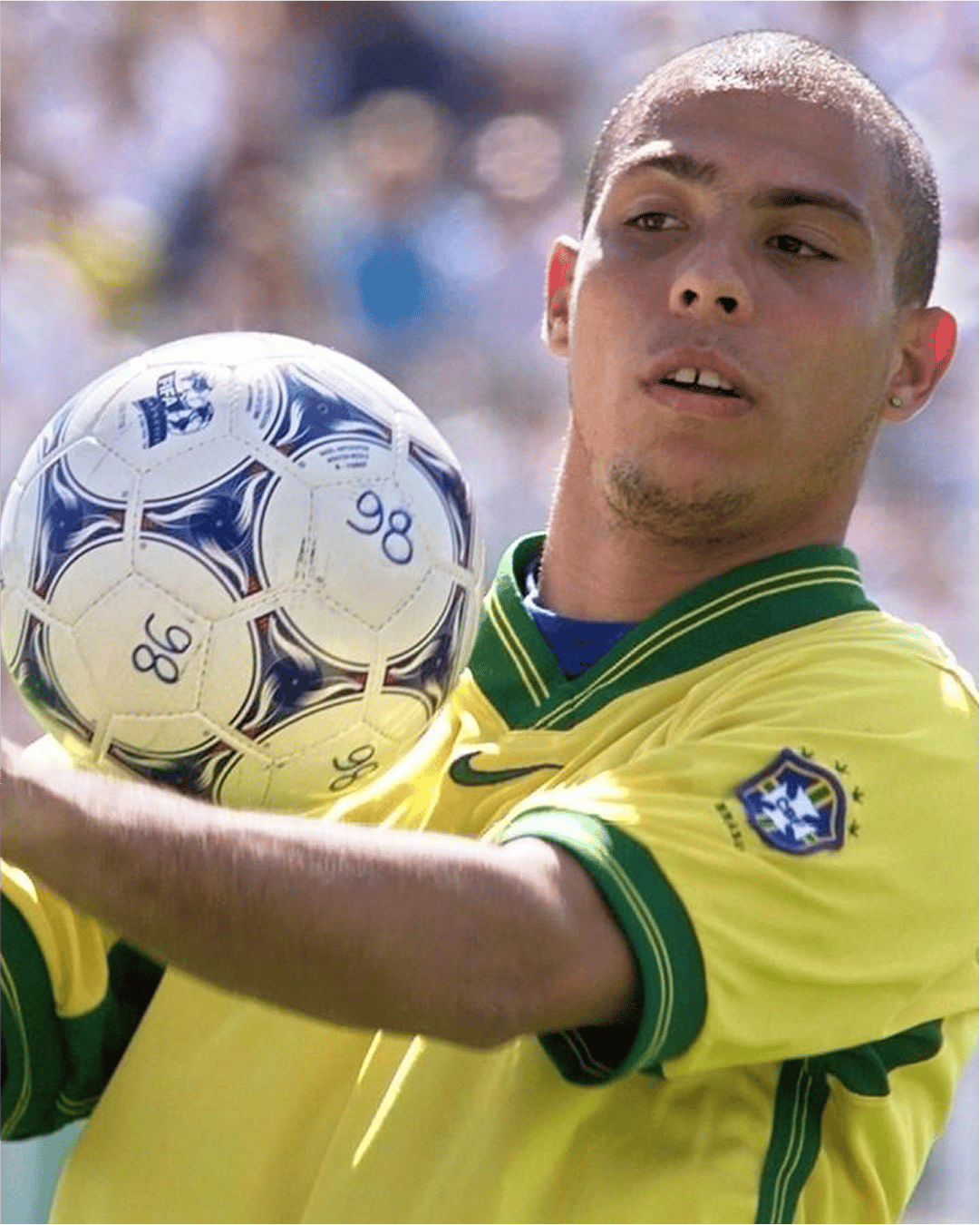
The early years were defined by geometry. The 1970 Telstar, all black-and-white hexagons, gave us functional graphic communication. A design chosen to look good on television screens that were still mostly monochrome. For designers, this was the first lesson, clarity beats complexity. A pattern that was simple enough to be iconic, and iconic enough to become simple.
Fast forward and the 90s hit differently. Suddenly, balls started carrying colour, abstract swirls, and nods to host nations identities. Graphic designers saw what was happening before anyone else, the ball was no longer just equipment. The 1998 Tricolore was the best early example of this for us. Designers recognised the evolution: from product to storytelling.
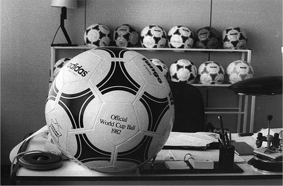

By the 2000s, things got bolder, sometimes too bold. The 2002 Fevernova split opinions (for what it’s worth we’re here for it). For footballers it was maybe unpredictable in flight. For designers, it was a case study in cultural references, pulling Asian calligraphy and flame motifs.
The 2010 Jabulani might be remembered by players for its aerodynamics, but in the design world it was something else. A near-perfect case of digital-era aesthetics personified, glossy, gradient-heavy, almost plastic in its execution. If the Telstar was analogue, the Jabulani was Photoshop layer.
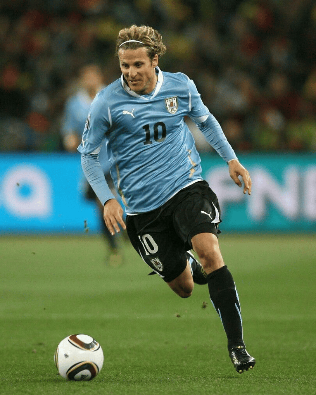
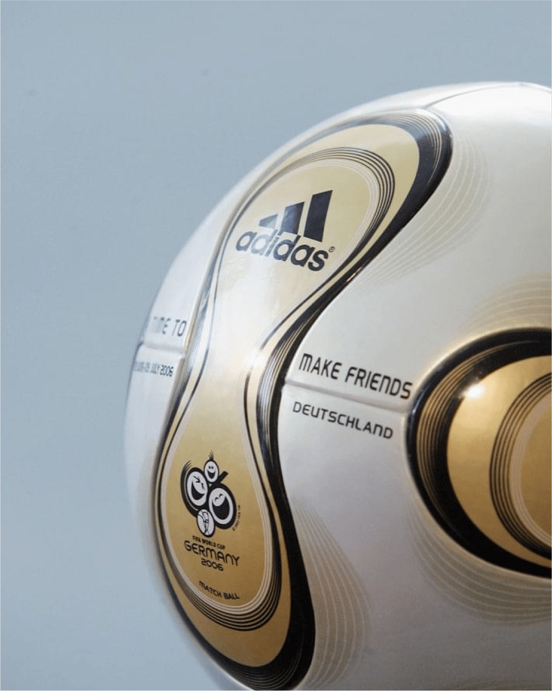
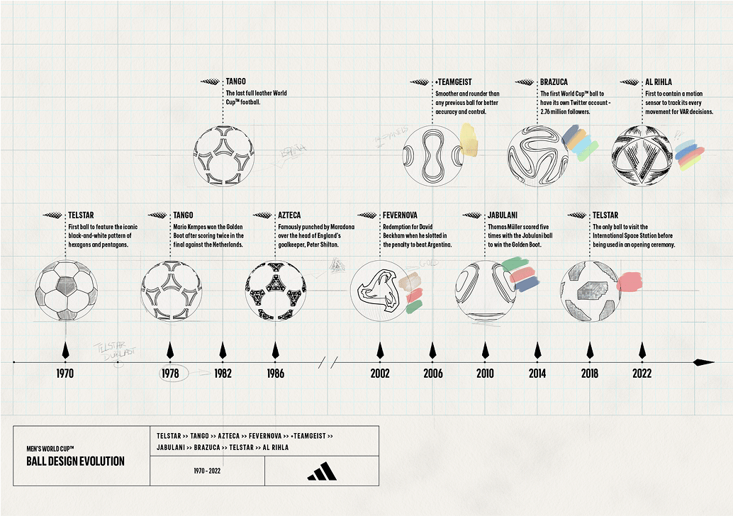
For graphic designers, these launches are case studies in shifting trends. Minimalism, maximalism, cultural motifs, nostalgia loops. But more than that, they show how sport can be a design arena in itself. No galleries needed. Just 22 players, a pitch, and the rest of the world watching.
The archive of World Cup balls is a graphic design timeline disguised as sporting history. And if you know how to look at it, it tells you almost everything about how design has moved with culture.
For us, every single ball has it’s own story and reference to nod to. Some more iconic than others, usually because of what moments players create with them rather than a colour or a shape used in design. But all deserve the reference of a shot of the good stuff. Some just stronger in taste than others.

Shot of the good stuff

