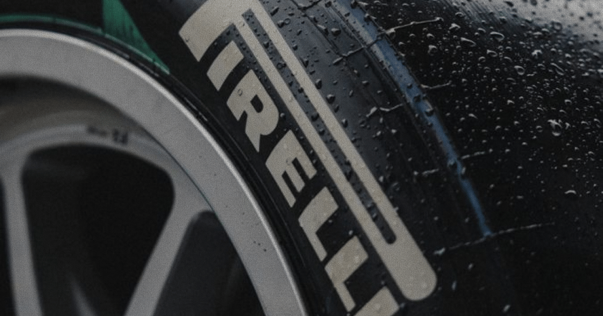
Espresso in hand, we didn’t have to go too deep into the archives to get hit with a dose of pure design nostalgia. Just a few frames in and the Pirelli world starts to unfold like a visual time capsule. For anyone obsessed with contemporary design, speed and rubber. This is Italian flavour done right. Their iconic wordmark alone is enough to send you into a whole new world. Is there a more beautifully designed identity in the automobile industry…?
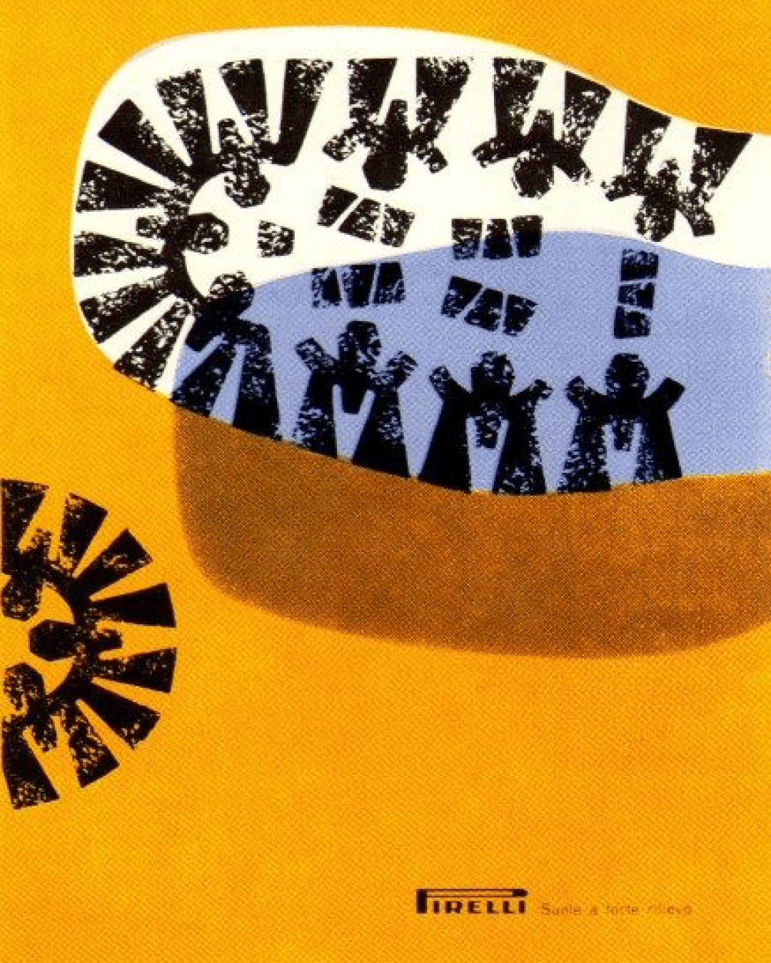
Pirelli’s posters tell you everything you need to know about intent in design. Real intent. Clean geometry, thick serif logotypes, colour blocking that looks like it was lifted from a Bauhaus lecture.
Every curve, every shadow, every word placement feels engineered. Pun very much intended.
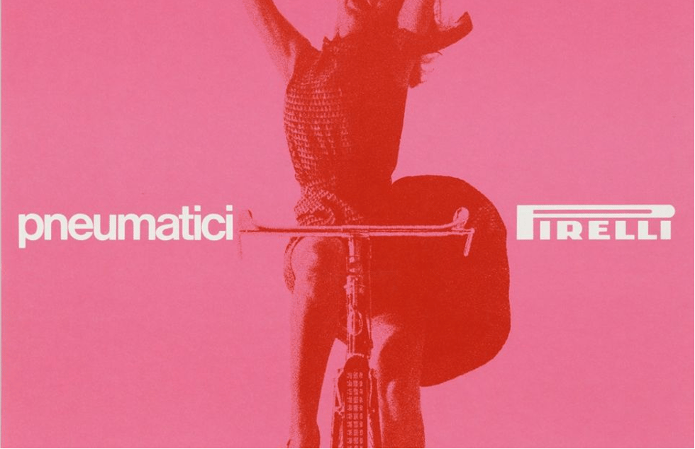
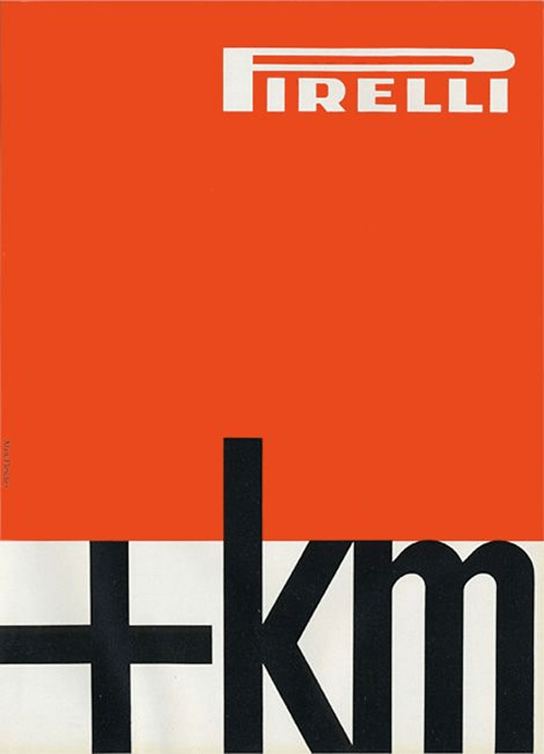
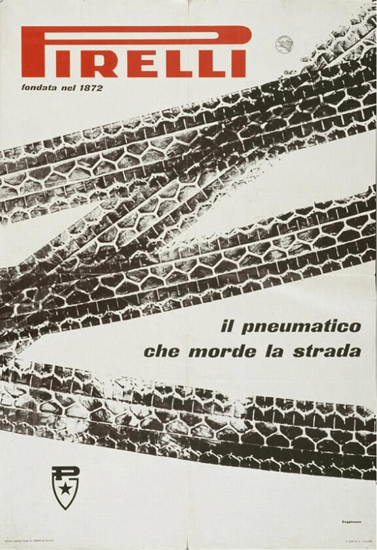
The longer you look, the more you get this sense of genuine design purpose and meaning. Even the famous Pirelli calendars look different when seen through a designer’s eye. Beyond the glamour, there’s typography, framing, movement. You start to see the design discipline hiding in plain sight, the control, the composition, the quiet confidence of the format.
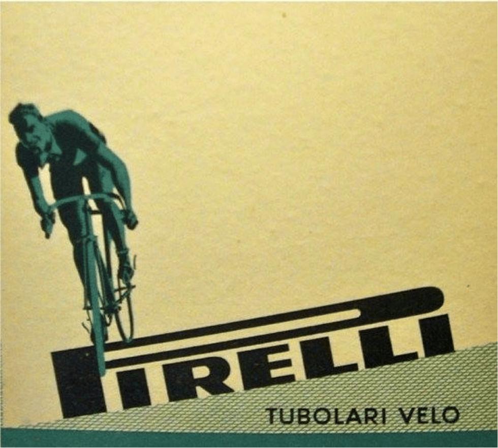
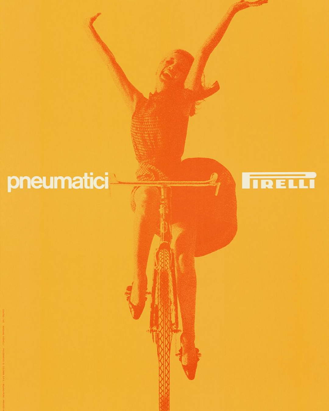
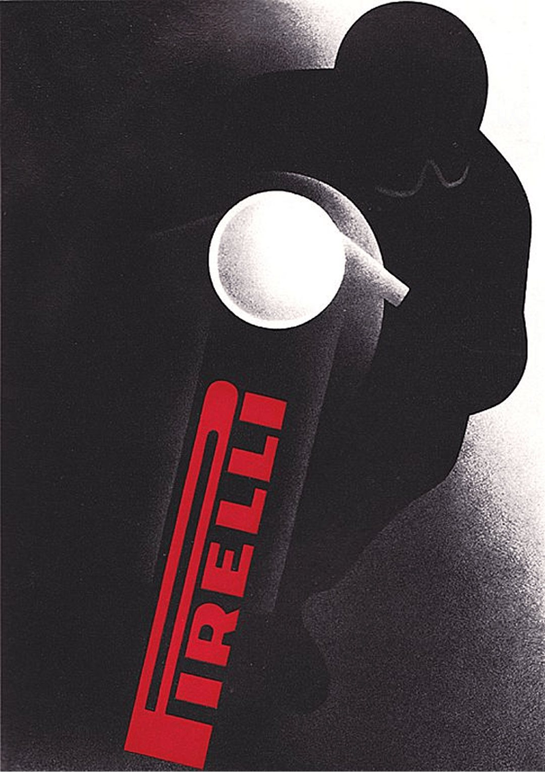
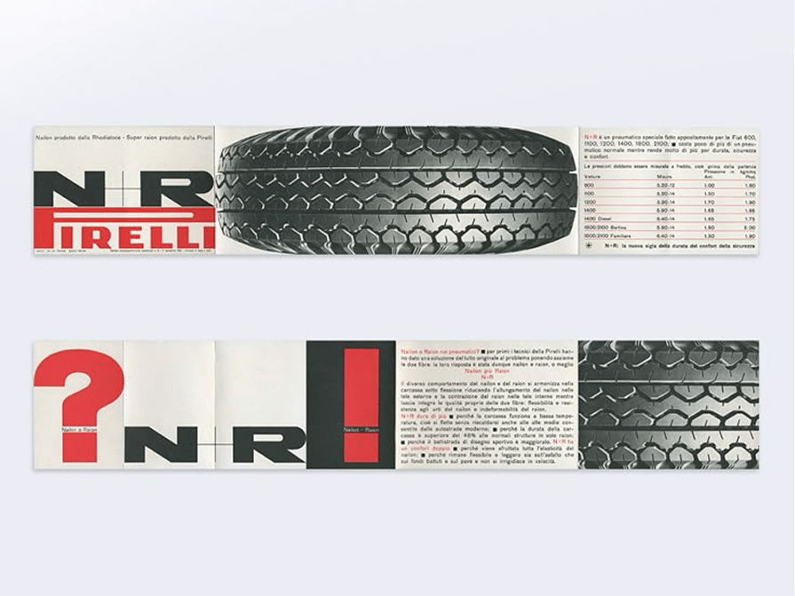
What’s fascinating about the archive is how modern it still feels. You can see traces of today’s editorial layouts, brand minimalism, and campaign storytelling rooted right here. It’s corporate identity before the digital grid, graphic communication before the algorithm.
The Pirelli archive is proof that real design doesn’t age. The kind of work that makes you want to slow down, sharpen your pencils, and find balance again.
When we tell you there is enough here for a second shot of the good stuff we are not just paying lip service. Watch this space.
Shot of the good stuff

