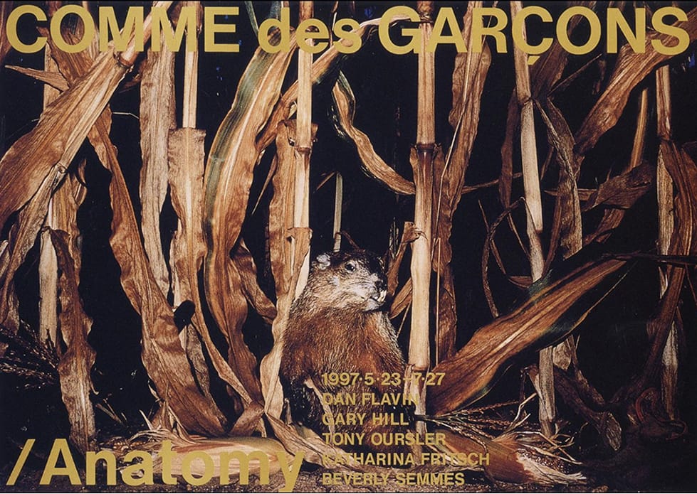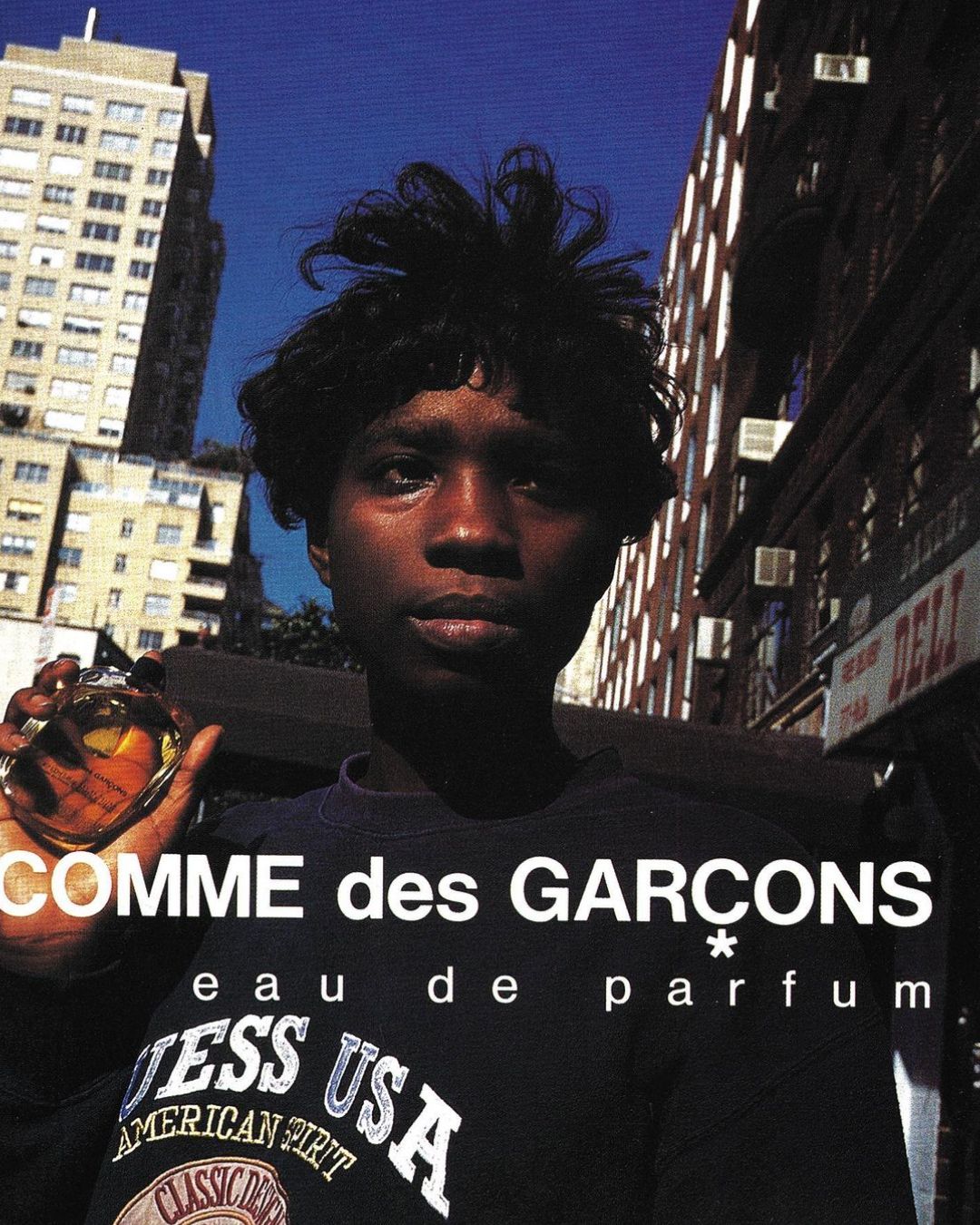
Graphics feel heavy, like they meant something.
Type had presence and it behaved like it knew it. Headlines didn't hover neatly at the top of layouts, they occupied space with intent. Compressed grotesques crashed into serif classics. Futura next to Times. Helvetica pushed past polite usage. Kerning tightened until it felt confrontational. The decisions weren't tidy and they weren't trying to be.
Spend time with early issues of The Face. Move through Ray Gun when David Carson was pulling it apart from the inside. Type broke grids because grids weren't treated as untouchable. Words bled into images and legibility shifted depending on how long you were willing to look.


There was appetite for risk and no apology attached to it.
Album sleeves carried the same energy. Nirvana's Nevermind. Massive Attack's fractured typography systems. Designers treated distortion as a language, not a filter. Photoshop had just arrived and its fingerprints were everywhere. Drop shadows stacked up. Chrome effects felt futuristic. Some of it feels excessive now.
Those imperfections are part of the composition.

Branding wasn't reduced for screens because screens weren't the priority. Early Nike ACG leaned into technical aggression. MTV idents shifted constantly, embracing inconsistency as identity. Wired's first covers carried gradients and collision rather than minimal calm. Logos held depth and dimension without worrying about favicon clarity.
Designers chose a direction and carried it through to print without running twelve variations past a dashboard. Files were closed and sent.


Designers chose a direction and carried it through to print without running twelve variations past a dashboard. Files were closed and sent.
Scrolling through those archives now, the through-line is personality. The work feels anchored to music scenes, skate crews, club nights, early web forums.

That's what graphic designers see when they look back at the 90's. A lack of refinement. Plenty of Conviction.
Shot of the good stuff.

