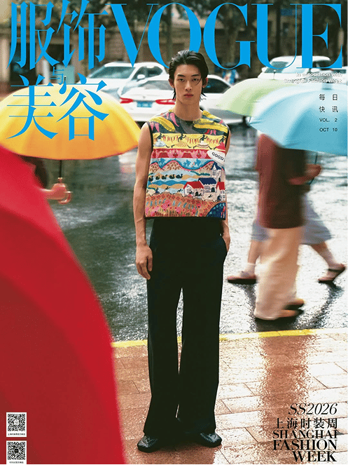
Shanghai showed up this week. Every corner of the city felt charged with creative energy. Not the curated calm of Paris or the nostalgia of Milan, but something faster, sharper, and more experimental. Lucky for us, the flat white still hit.
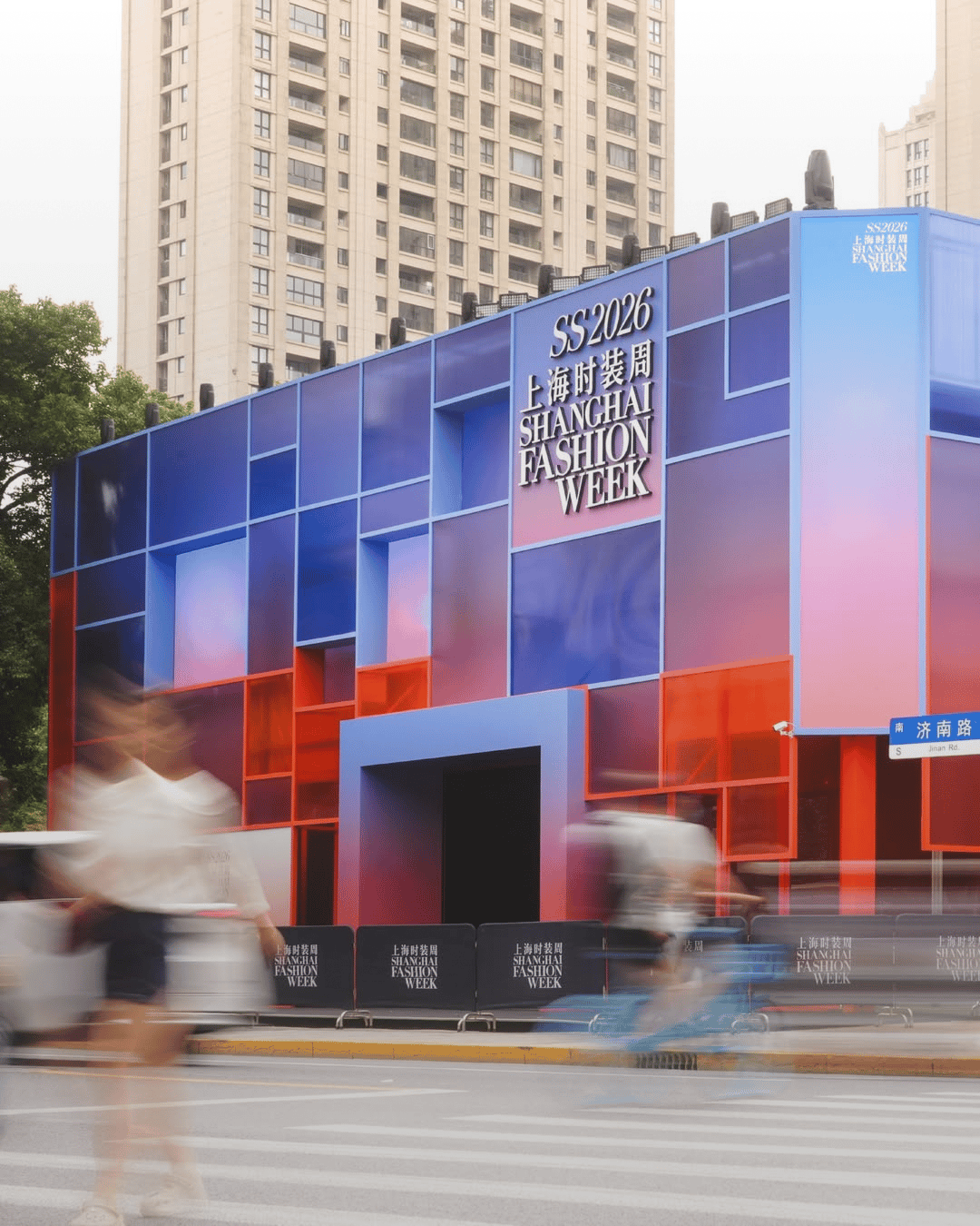
You could feel it in the signage, in the show sets, even in the light reflecting off glass towers. The entire week moved like a visual system in motion. For graphic designers, Shanghai Fashion Week was a study in composition. Typography is never secondary.


This season, type became part of the runway. Brand marks were oversized, often three-dimensional, and used to frame the collections themselves. Invites arrived looking more like gallery ephemera than event collateral. Serif met sans-serif in delicate balance. Even sponsor backdrops, often an afterthought elsewhere, felt built with precision.
This city’s visual world lives in colour. This year’s event is no exception. Palettes stretched from metallic chrome to warm clay, from citrus gradients to deep ocean blues. The tones shifted with the time of day, each collection finding its own light.


The influence of digital culture was everywhere. Gradients, pixelation, and holographic finishes hinted at how design and fashion now share the same visual grammar. Where other cities edit, Shanghai embraces volume. It’s a place where contrast feels like confidence.
A sign of where identity is heading. We see it. Flexible, reactive, adaptable. Design that behaves more like a conversation than a stamp.
While European weeks rely on heritage to hold attention, Shanghai builds anticipation through innovation. It understands that modern identity isn’t about repetition. For designers, it’s a reminder that good branding isn’t static anymore. It lives across surfaces, screens, and sounds. It’s layered, kinetic, and fluid. Shanghai captures
that beautifully.
And for us watching, that’s the most inspiring thing of all.

Shot of the good stuff

