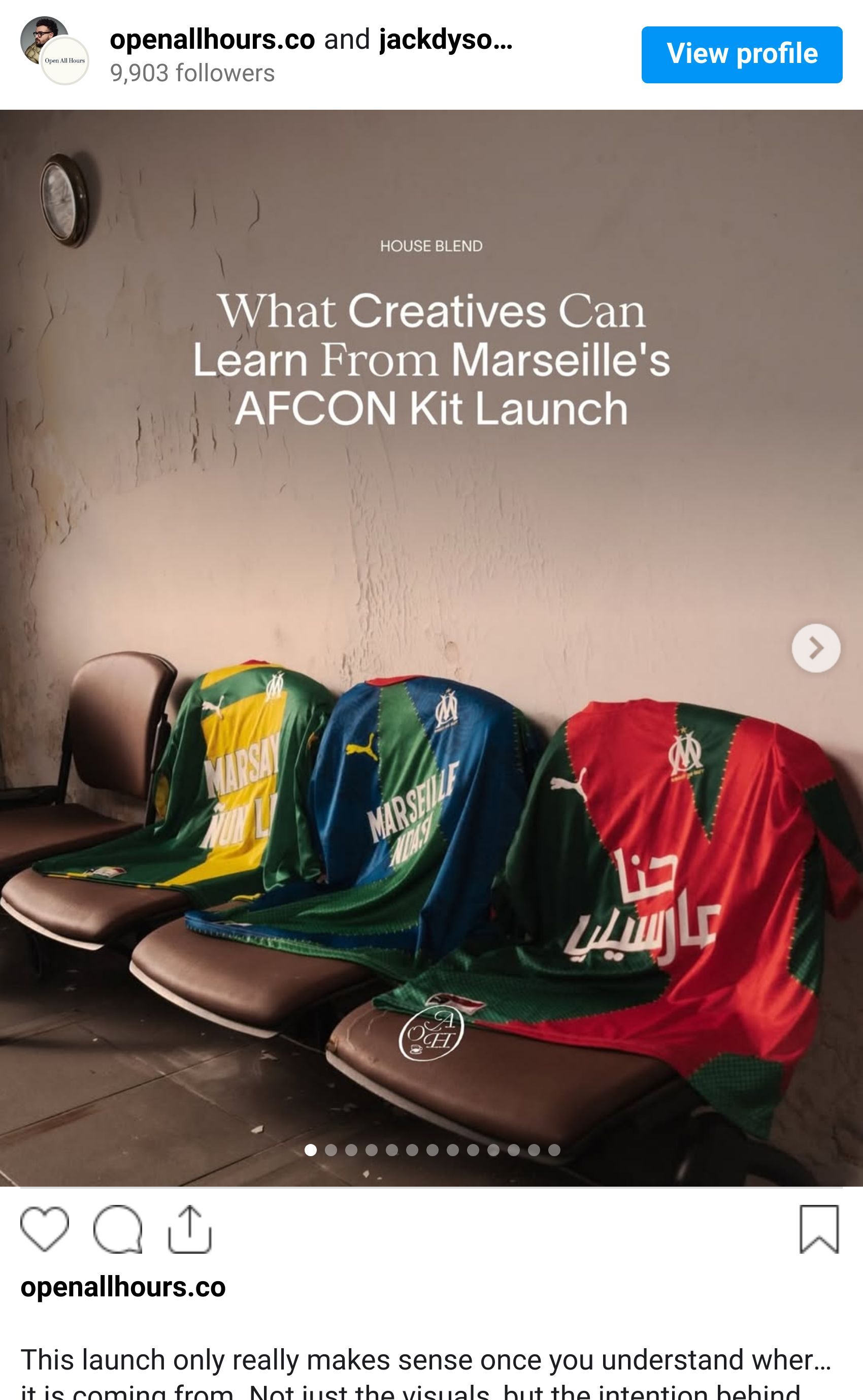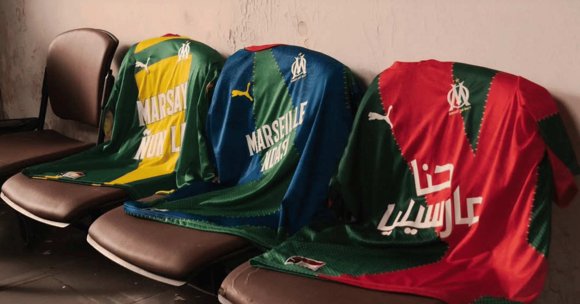
This launch only really makes sense once you understand where it is coming from. Not just the visuals, but the intention behind them.
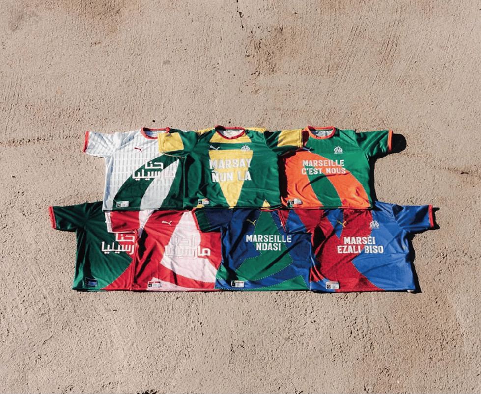
Olympique de Marseille released seven new kit designs at once, created in collaboration with African-rooted designer Tareet, timed around AFCONs. That context matters. Marseille is a club shaped by movement, migration, and layered identity. This is a city where African and Mediterranean cultures are not influences. They are foundations.

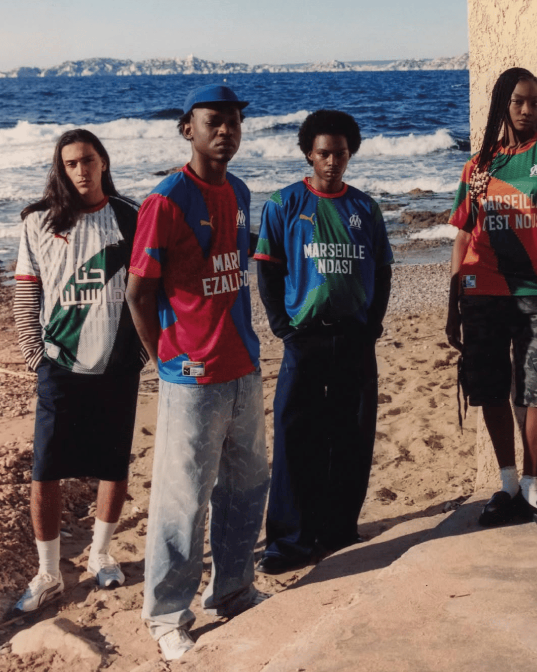
Target’s involvement isn’t treated like a feature credit or a marketing add-on. It’s the vision. Each kit draws from African visual language, pattern systems, and symbolism, but never as surface decoration. These references are structural. They inform geometry, repetition, and composition rather than sitting on top as graphics.
Seen individually, the kits feel expressive and distinct. Different colours, patterns, and moods. Each to represent a nation’s identity. But the real idea only reveals itself when you view all seven together. Laid together in unity, the designs align to form a complete image of the Marseille crest. Fragmented pieces combining into a unified whole.
That decision reframes the entire launch.
This was never about producing seven options. It was about designing a system. Each kit is one component in a larger visual language. No single jersey carries the full story on its own. The identity lives in the collection.
That is the lesson for creatives.
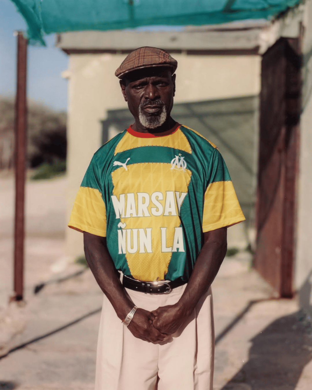
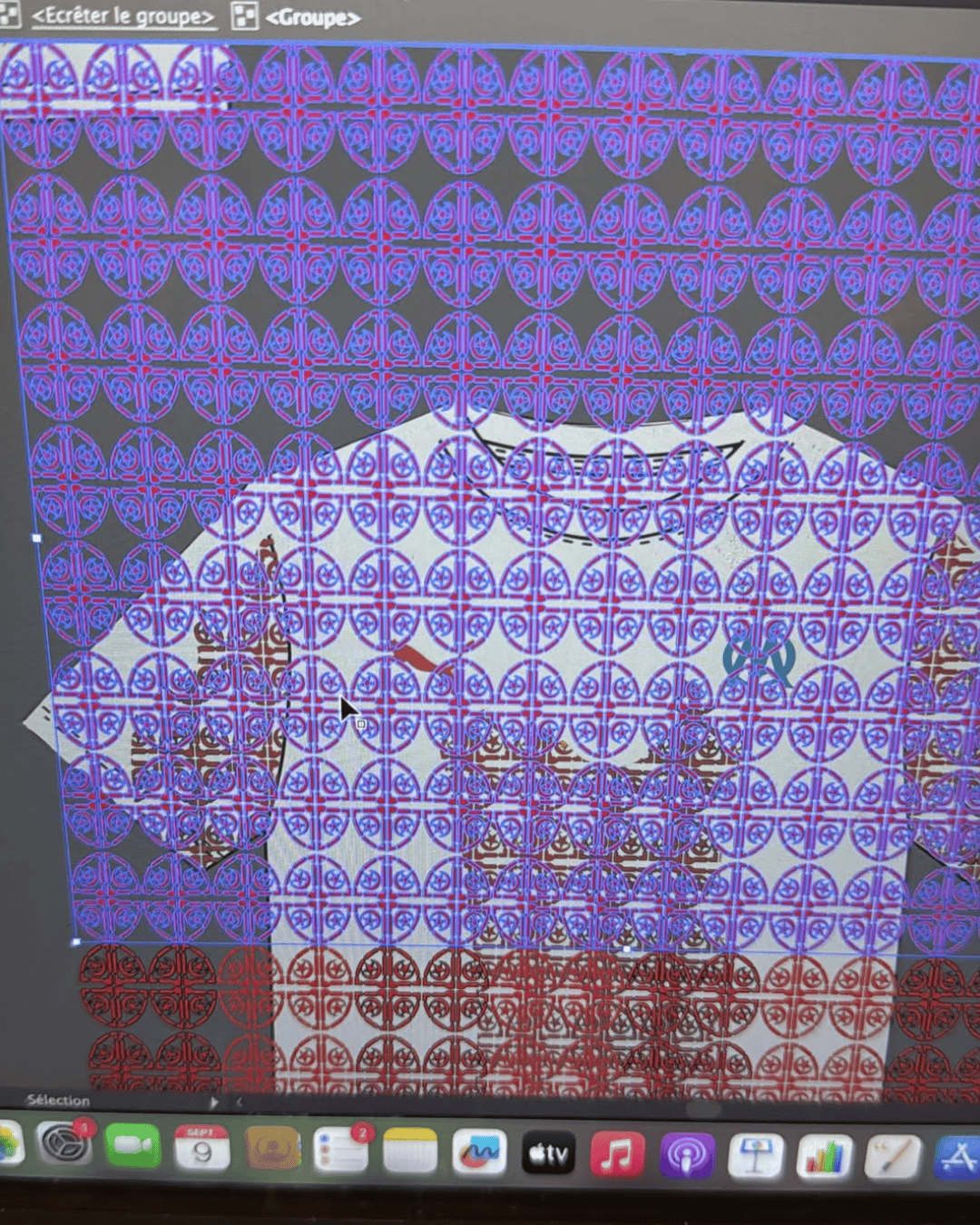
Too often, work is judged in isolation. One post. One product. One asset. Marseille's approach asks for patience. It trusts the audience to zoom out. To connect dots. To recognise that meaning can live across multiple expressions rather than being forced into one.
The AFCON context strengthens this further. African-rooted design here is not used to signal relevance or trend alignment. It reflects the players, supporters, and communities the club represents. Culture is treated as authorship, not inspiration.
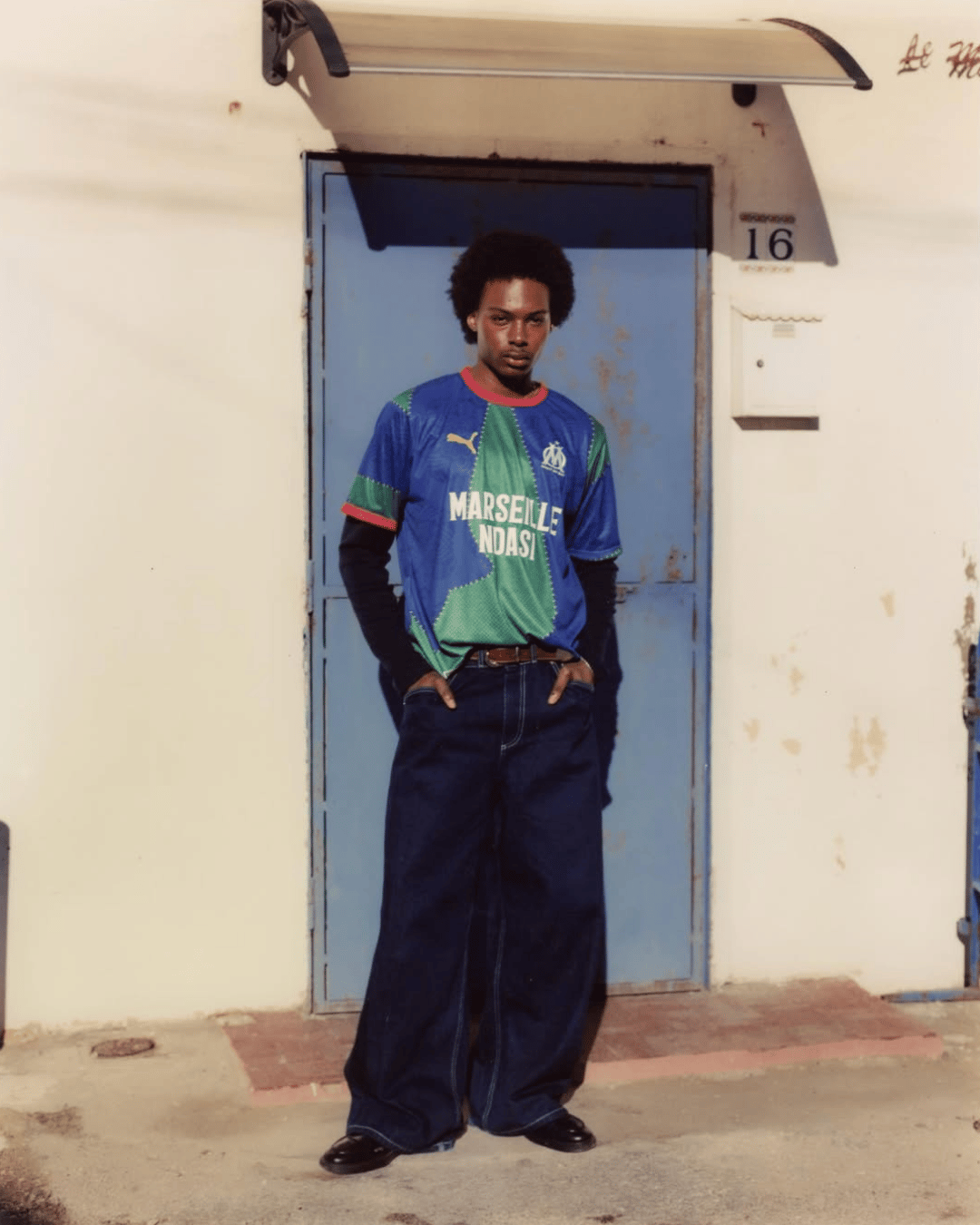
For designers, this is a reminder of what happens when concept leads execution. When you start with a clear system, every output reinforces the idea rather than competing with it. Consistency becomes the amplifier.
In a year where many launches rely on staggered drops, heavy PR, and short-term attention, Marseille chose clarity instead. Seven kits. One release. One identity revealed through cohesion rather than noise.
The takeaway is simple, but easy to forget.
Design does not need to shout when the system is strong enough to speak for itself.
Shot of the good stuff.


