
A storefront is the first line of a story, a glimpse of what’s waiting inside. Like the cover of a book, it sets the tone, builds intrigue, and offers a hint of the world beyond its doors.
Whether it’s a flagship store or a small local boutique, walk through any city and you’ll notice how storefronts reflect the character of the place they belong to. They nod to its rhythm, history, and attitude.
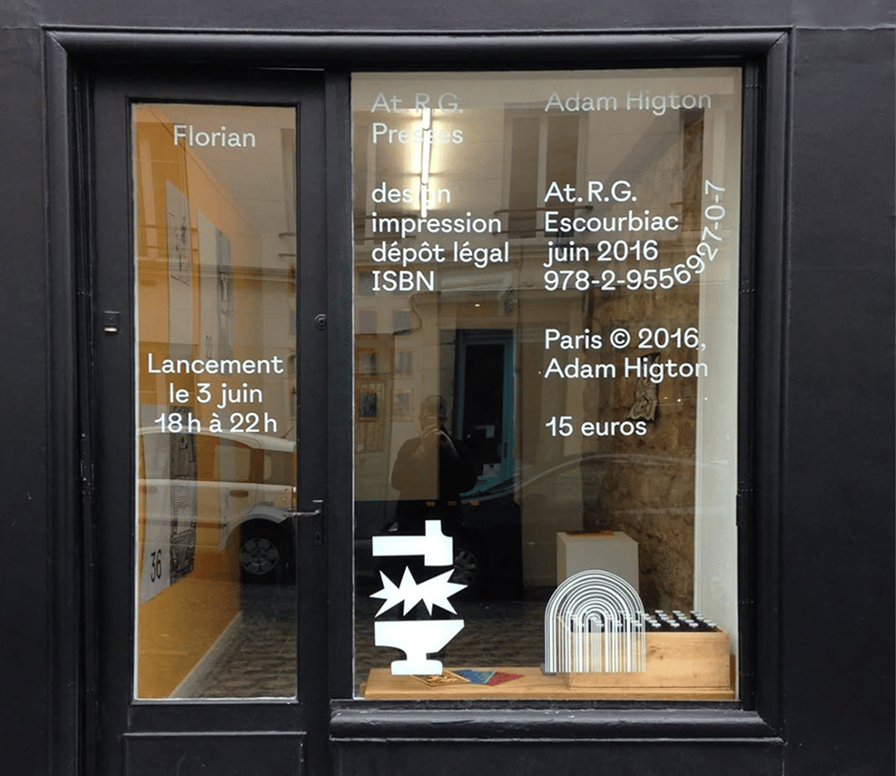
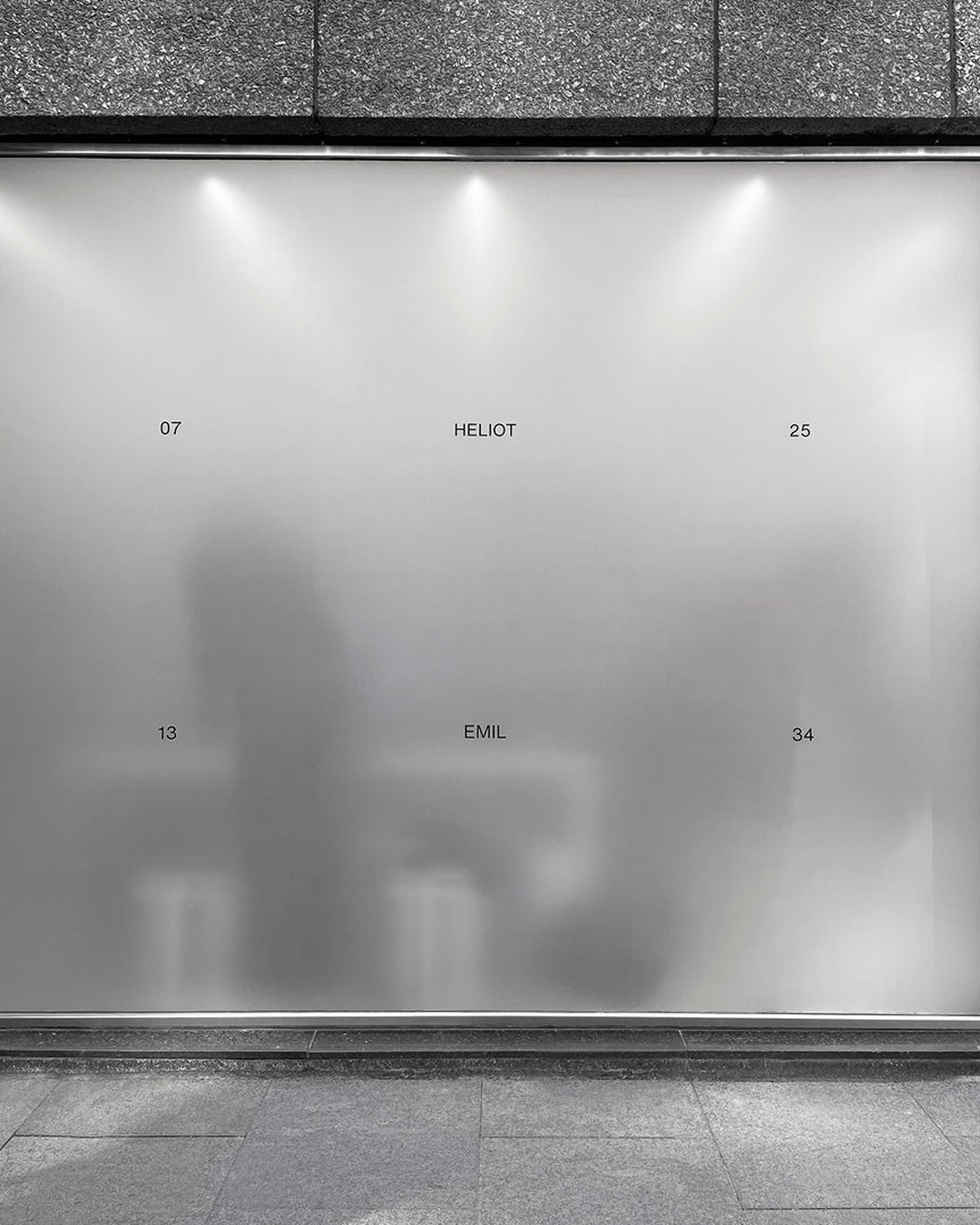
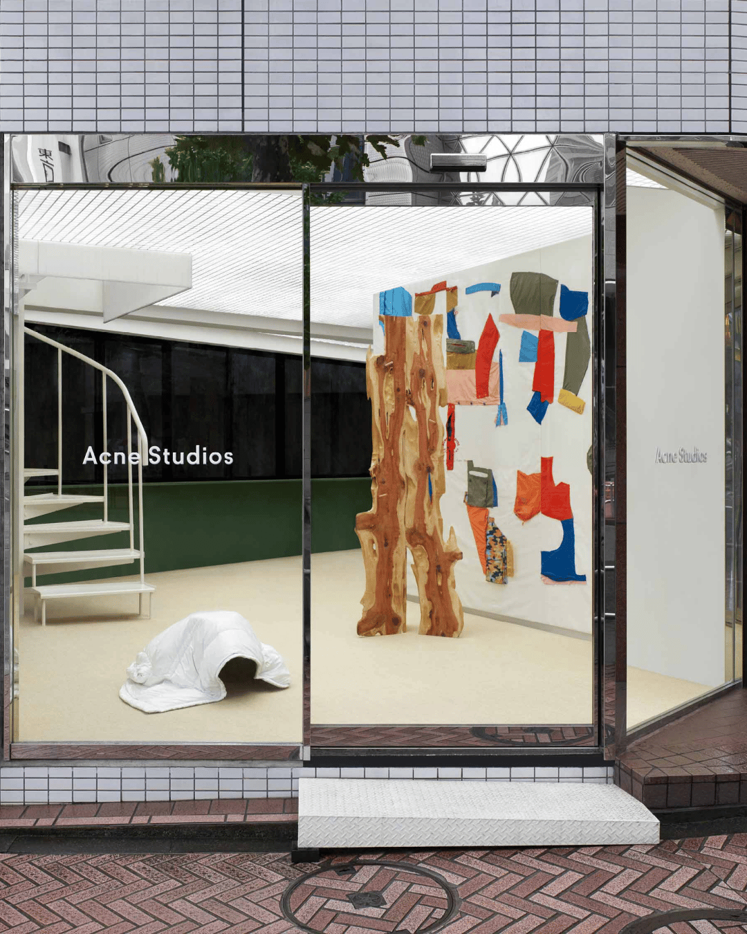
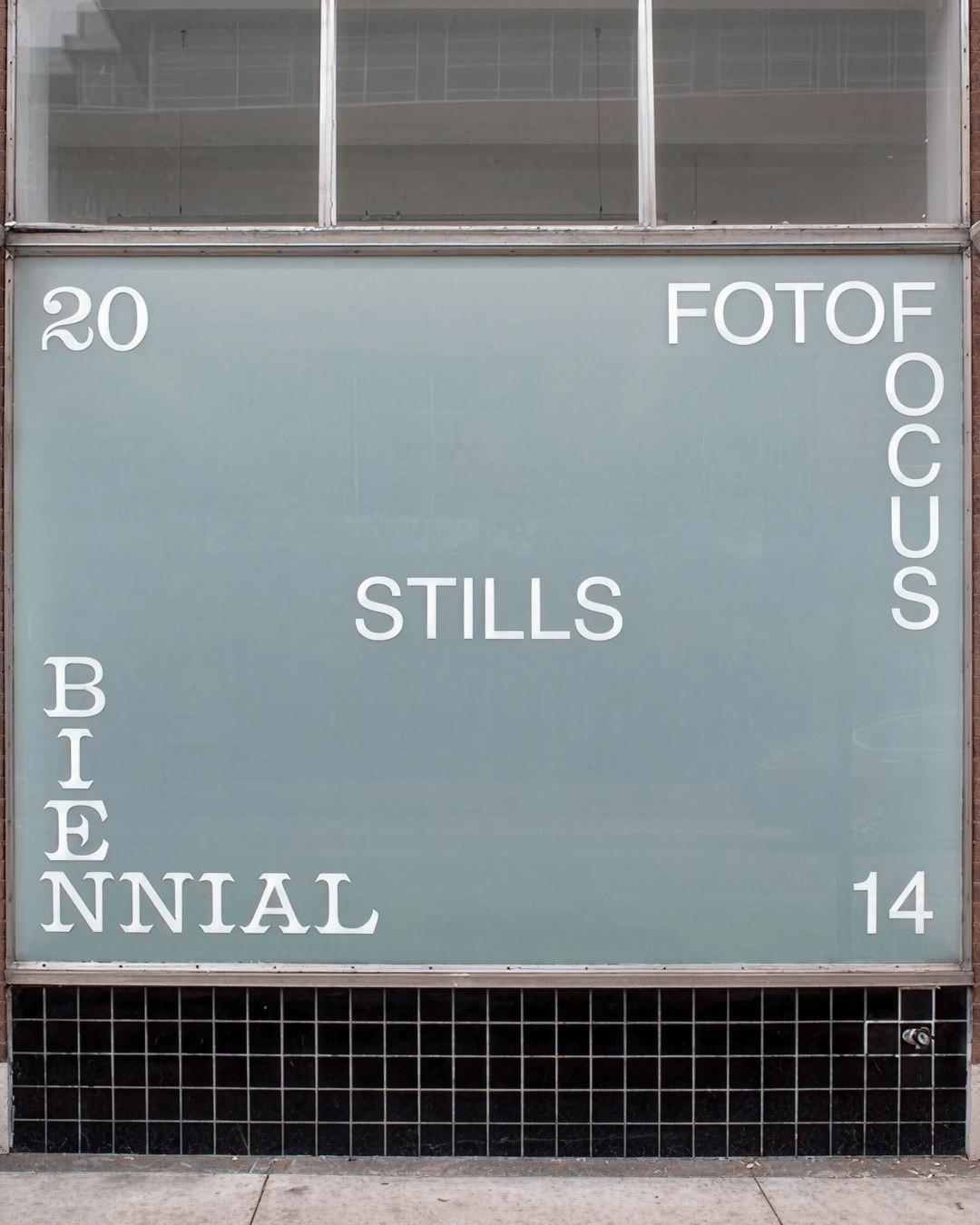
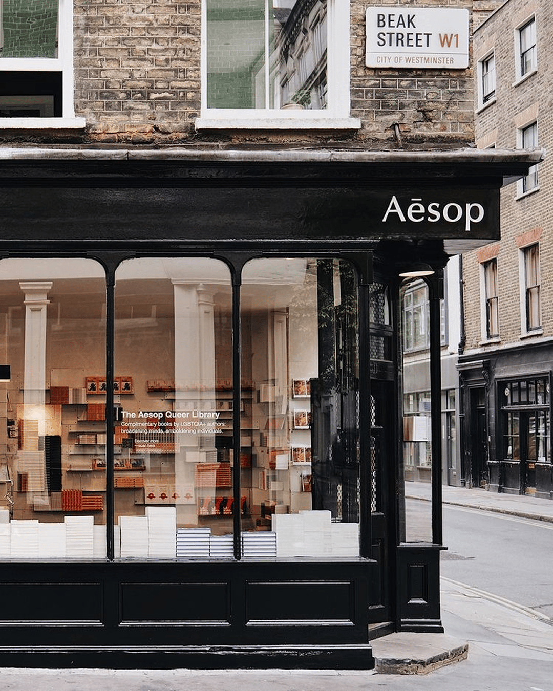
Aesop is a fascinating brand to study through this lens. Each store is designed in collaboration with local architects and designers, creating spaces that respond to their surroundings. From Cape Town to London, Oslo to Singapore, Aesop’s approach to retail design is rooted in respect for community, culture, and history. The result is a global network of stores that are visually connected yet each distinctly shaped by the city it inhabits.
Another layer of Aesop’s strategy lies in the intention behind where they choose to open. As Ashwinn Krishnaswamy, founder of Forge Design has pointed out, price, design, and language alone aren’t always enough to position a brand as luxury. Distribution and location play an equally important role. A brand with stores in areas like Mayfair or Fifth Avenue instantly carries an added sense of status.
Combine that with distinctive, thoughtful storefront design, and you have a powerful mix. One that communicates both substance and exclusivity before a customer even steps inside.
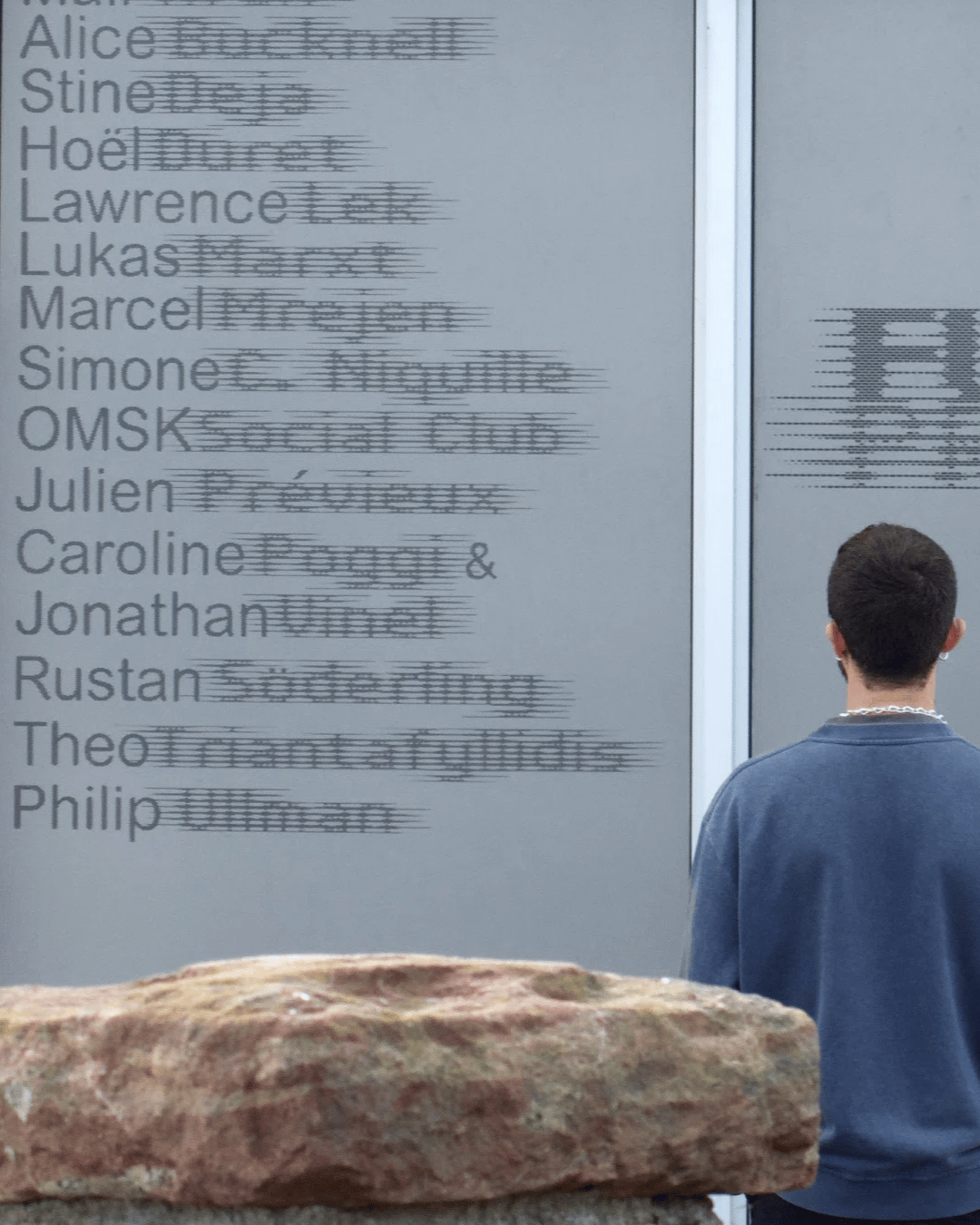
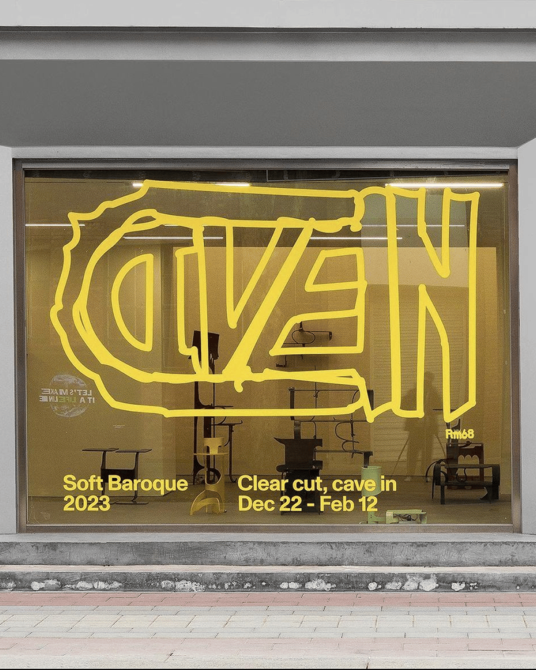
And then there’s the typography and design itself. Type on glass has a kind of magic that’s impossible to replicate on paper. It’s hard to define, but somehow everything feels elevated when it’s applied to a window. The reflection, the depth, the way light shifts through it. A layout that might feel flat in Figma suddenly comes alive when it sits behind glass.
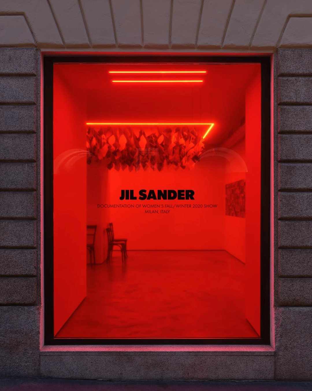
Some of my favourite examples come from Jil Sander stores, which pair their clean logotype with bold colours like yellow or burnt orange, often softened by floral displays peeking through frosted glass. It’s eye-catching but refined, deliberate.
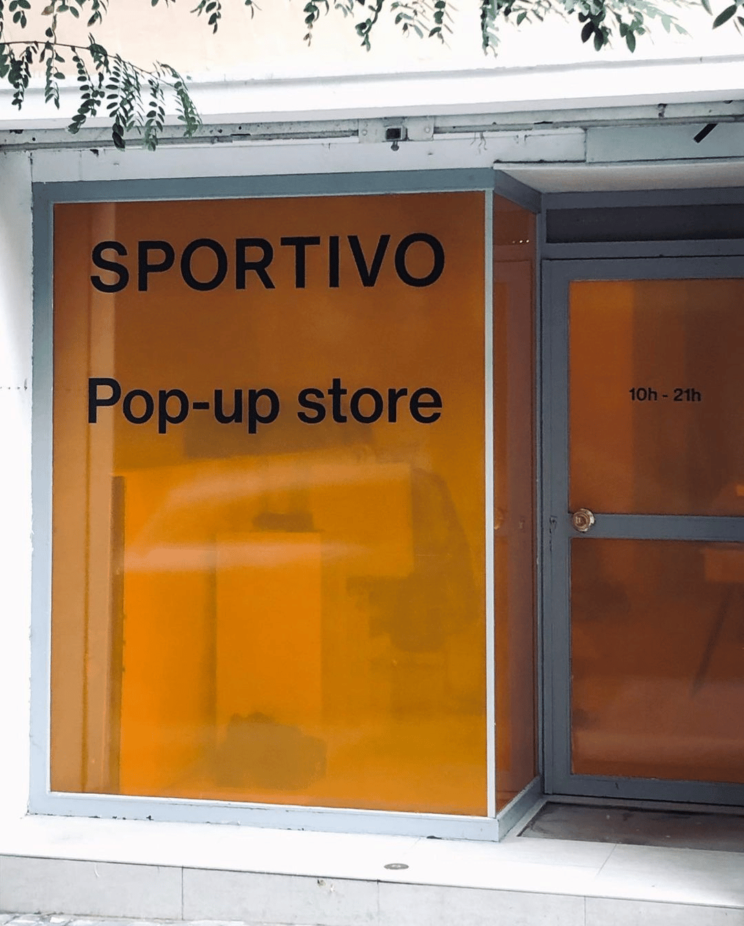
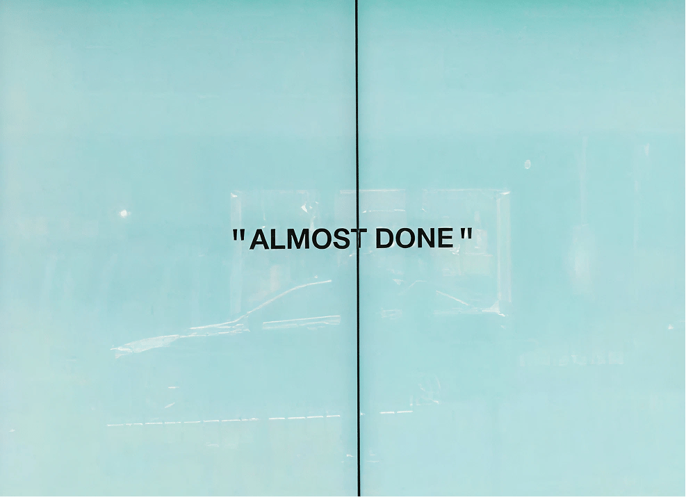
A well-designed storefront does more than invite people in. It tells a story before a word is spoken. It’s where brand, architecture, and emotion meet, shaping how people feel long before they walk through the doors.
The best examples show that design at the street level isn’t just about selling products. It’s about creating a moment and a pause that captures the spirit of a brand and the soul of the city it lives in.
Shot of the good stuff


