
Ever look at a brand or a piece of your own work and think, this feels flat? With most design today made for digital mediums, we’ve lost some of that raw, human touch that older design naturally carried.
Texture has become an afterthought. After all, why fake a texture when it’s not real? You can’t actually feel something through a screen, right? So why bother trying?
The thing is, texture has always been one of the quiet differences between brands that connect and those that don’t, between an image that gets saved and one that’s forgotten.
But in a world where digital dominates, how can we bring texture back into our work in a way that feels natural, subtle, and real?


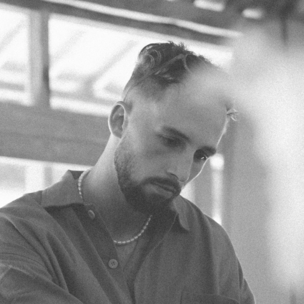
SR_A by Samuel Ross is an interesting brand to study in this context. Most luxury fashion brands lean towards an ultra-clean aesthetic. Flawless studio photography, crisp typography, and sterile precision. SR_A moves in the opposite direction. The brand embraces the rawness of process. The texture of a fabric, the rough scan of a product sketch, using these imperfections to tell
a story of craft and creation.
On sr-a.com, just above a signature, you’ll find the words:
“Craft, leisure, technology, comfort.
Material, shape, colour.
Soft and hard wearable goods.”
These aren’t just brand values.
They’re the foundation of its visual identity.
Ross’s signature use of micro-typography, paired with textures drawn from the products themselves, gives the brand a human quality. There’s a sense of quiet on the website and Instagram feed - a calm that cuts through the visual noise of social media.


Mouthwash Studio’s ‘Freaks of Nature’ campaign with Nike Trail draws on the nostalgia and emotional pull that texture and certain eras of graphic design can bring. The campaign, in their own words, “prioritizes emotion before any other measure of success… abandoning the need to always show product.”
At its core was a single, striking image: the imprint of a trainer pressed into dirt. It’s a refreshing take on the traditional, product-heavy campaign. That shot alone gives you everything you need: the grit, the conditions, the determination of the ‘freaks of nature’ who get out and run no matter the weather.
Grain and rough texture were used throughout the campaign’s graphics, nodding to the heritage work that helped make Nike iconic.
Would clean product shots or a simple series of runners on a pleasant trail have had the same impact? Probably not.
It was the grit, the imperfections and the rawness of the graphic system that made Freaks of Nature stand out.


Hear the word texture and as a designer you can immediately think of Photoshop overlays or paper textures. But texture can come from so much more than that. It can be found in the environment around a product or in the state the product exists in.
Salt & Stone do this beautifully. Their imagery captures the visceral sensations their products evoke: condensation on a bottle, sweat after a tough workout, sunlight on skin. These details build a sense of familiarity and connection between the brand and its audience.

There are times when texture in design begins to feel like art. Mark Busch’s work is a perfect example. Some of the most captivating compositions I’ve seen are his, combining unexpected objects and imagery to create something that feels deeply expressive.
His work shows just how far texture can go. It challenges how we experience design through a screen and proves that digital work can still evoke something tactile and emotional.


Texture is a bridge between the physical and digital, a reminder that design has roots in the real world. When used well, it adds depth, honesty and emotion to a brand or image. It can make something feel lived-in rather than manufactured, familiar rather than distant.
The key is to approach it with intention. Don’t add texture for the sake of nostalgia or trend. Think about what it communicates and how it supports the story you’re telling. Sometimes that means a subtle grain over a photo, sometimes it means letting the imperfections of process show through.
As design continues to exist mostly on screens, texture might just be one of the few tools we have left to make things feel real again.
Shot of the good stuff
