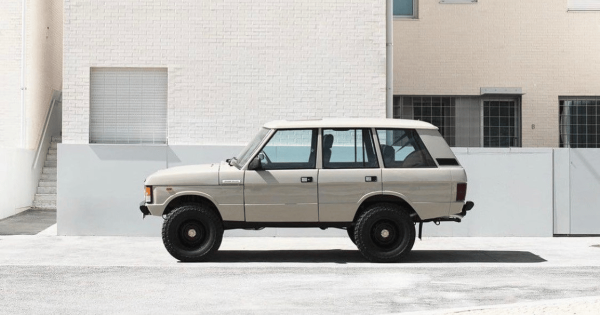
Range Rover didn’t need a new identity. It already had one.
Across the world, that oval badge has become synonymous with quiet, and loud, luxury, British engineering, and a kind of automotive presence that doesn’t shout but still dominates the room. So when news broke this month about a visual update to the brand, the usual speculation followed. Was this a total redesign? Were they walking away from the legacy? Would this be another case of a heritage brand flattening itself in the name of digital clarity?
Not quite. In fact, not at all.
What Range Rover has done here is something far more considered, and far more strategic. Rather than overhaul its identity, it filled a gap that had been quietly lingering for decades. The brand didn’t abandon the badge. It simply added the symbol it never had.
This wasn’t about change. It was about completeness.
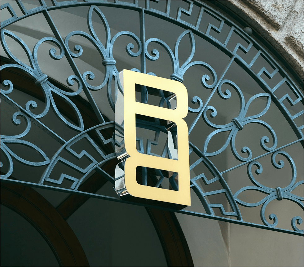
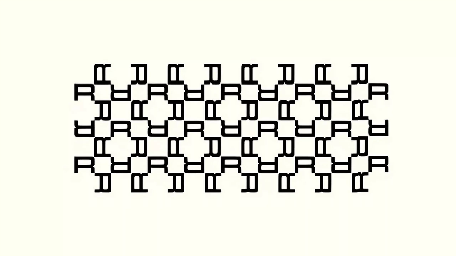
At the heart of the update is the introduction of a new monogram icon, a refined 'RR' insignia, designed to sit alongside the existing wordmark and oval marque. It’s bold, elegant, and immediately ownable.
Most importantly, it finally gives Range Rover something its visual system has always lacked: a scalable symbol that can be used across touchpoints, from digital avatars to stitched leather interiors. In other words, a shorthand for the world they’ve already built.

It’s worth stating again: this is not a rebrand. This is the formalisation of a system that already existed intuitively. What Range Rover and their design partners have done is codify the language, turning instinct into structure. It’s a case study in brand architecture done with maturity, not panic.
Too often, we see heritage brands attempt reinvention under pressure. They water down history in a chase for relevance, flattening logos, defaulting to sans-serif minimalism, and abandoning the very textures that made them desirable. Range Rover has done the opposite. This is brand building by addition, not subtraction.
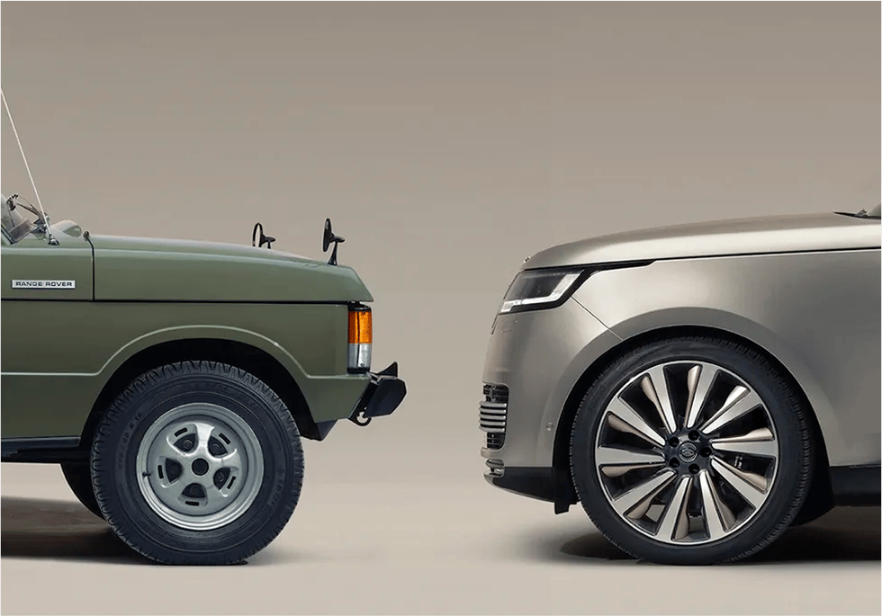
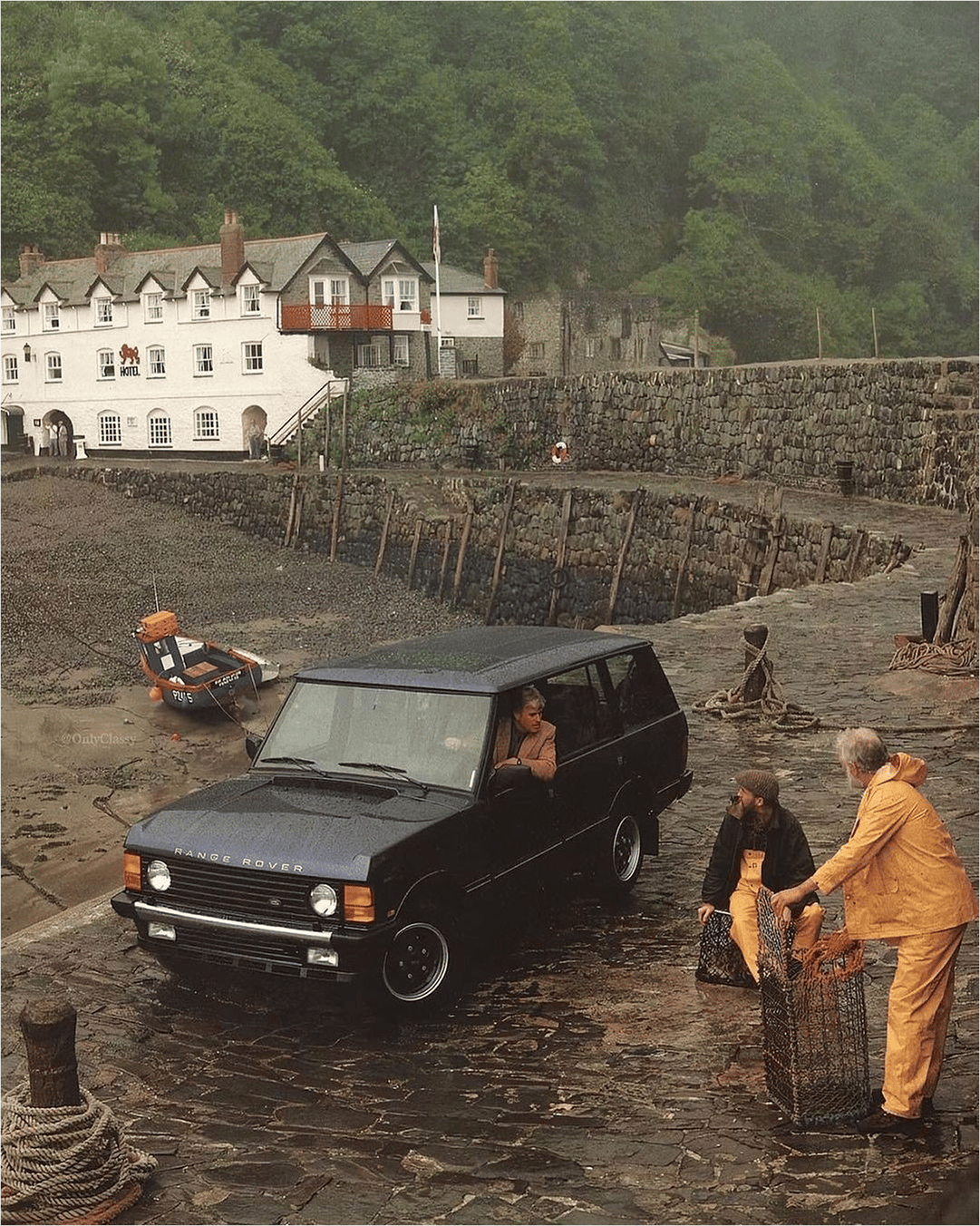
The introduction of the monogram isn’t just aesthetic. It’s functional. It unlocks a flexibility the brand has long needed in a visual-first world. It works on social media, embossed on key fobs, floating subtly in the corner of campaign films. It gives Range Rover the kind of multi-speed identity system modern brands rely on, one that shifts effortlessly between product, lifestyle, retail, and digital.
That matters more than ever in today’s brand landscape. Range Rover isn’t just a car manufacturer. It’s a design-led brand operating across fashion, travel, interiors, and cultural influence. From its collaborations with tailoring house Henry Poole to its bespoke SV division and the rise of the “Range Rover lifestyle,” the brand sits firmly in the crossover space between product and persona.
And in that space, having an adaptable identity system isn’t a luxury. It’s a necessity.
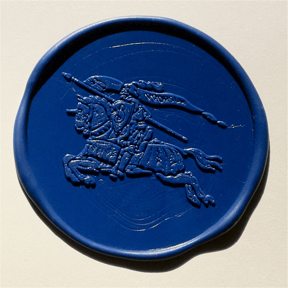
Compare this update with some of the strongest brand identity systems we’ve seen in recent years, think Burberry’s recent symbol reintroduction, or Moncler’s modular brandworld built around its mountain-inspired icon. These systems are flexible enough to stretch across collections and campaigns, but always anchored by a singular visual signature. Range Rover has now joined that club.
It’s no coincidence this monogram arrives as Range Rover continues to expand its positioning beyond the car itself. The brand’s digital presence has sharpened. Product design is more considered than ever. The showroom experience mirrors a luxury retail environment. Even the tone of voice has shifted, less spec sheet, more storytelling.
This visual update supports that evolution without forcing it. It doesn’t try to make Range Rover something it’s not. Instead, it reflects the confidence of a brand that knows who it is. A brand that didn’t need to shout louder, just clearer.
This is where so many modern brands fall short. They over-index on novelty. They mistake volume for vision.
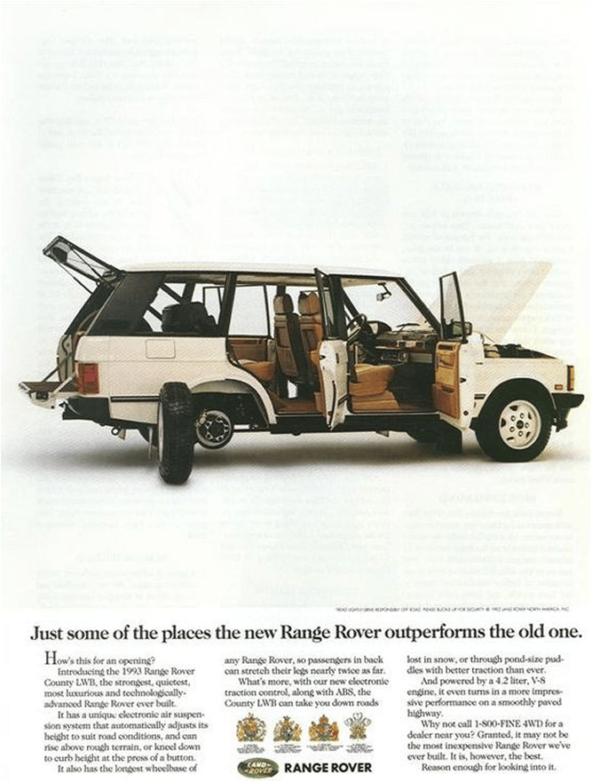
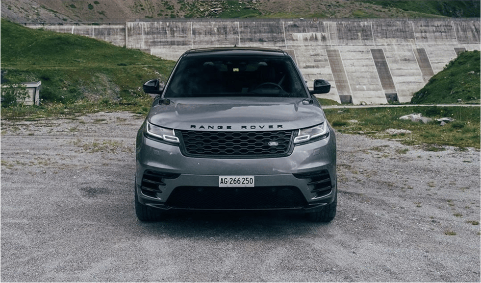
Range Rover’s new icon works because it’s not trying to steal the show. It’s not a gimmick or a gimmicky launch. It’s a foundational mark, designed to sit beside the existing suite, not replace it. And in that sense, it’s a subtle but powerful lesson in how to grow a brand without losing its centre.
From a creative direction standpoint, this is one of the most compelling brand updates we’ve seen this year. Not because it’s flashy, but because it’s clear. The icon isn’t trying to carry the weight of the brand. It’s playing its part in a system, a key visual anchor within a broader storytelling ecosystem.
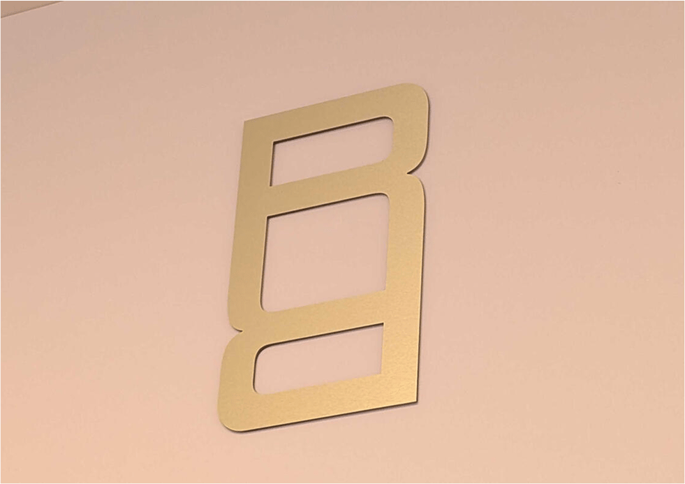
The execution is also telling. The rollout of the icon was measured, not performative. No viral stunts. No tired tropes about “a new chapter.” Just thoughtful design, placed in the right places. A bit like the cars themselves.
If anything, this update is a reminder that legacy brands have earned the right to move with patience. To choose refinement over reinvention. To build systems that last, rather than chasing quarterly hype cycles.
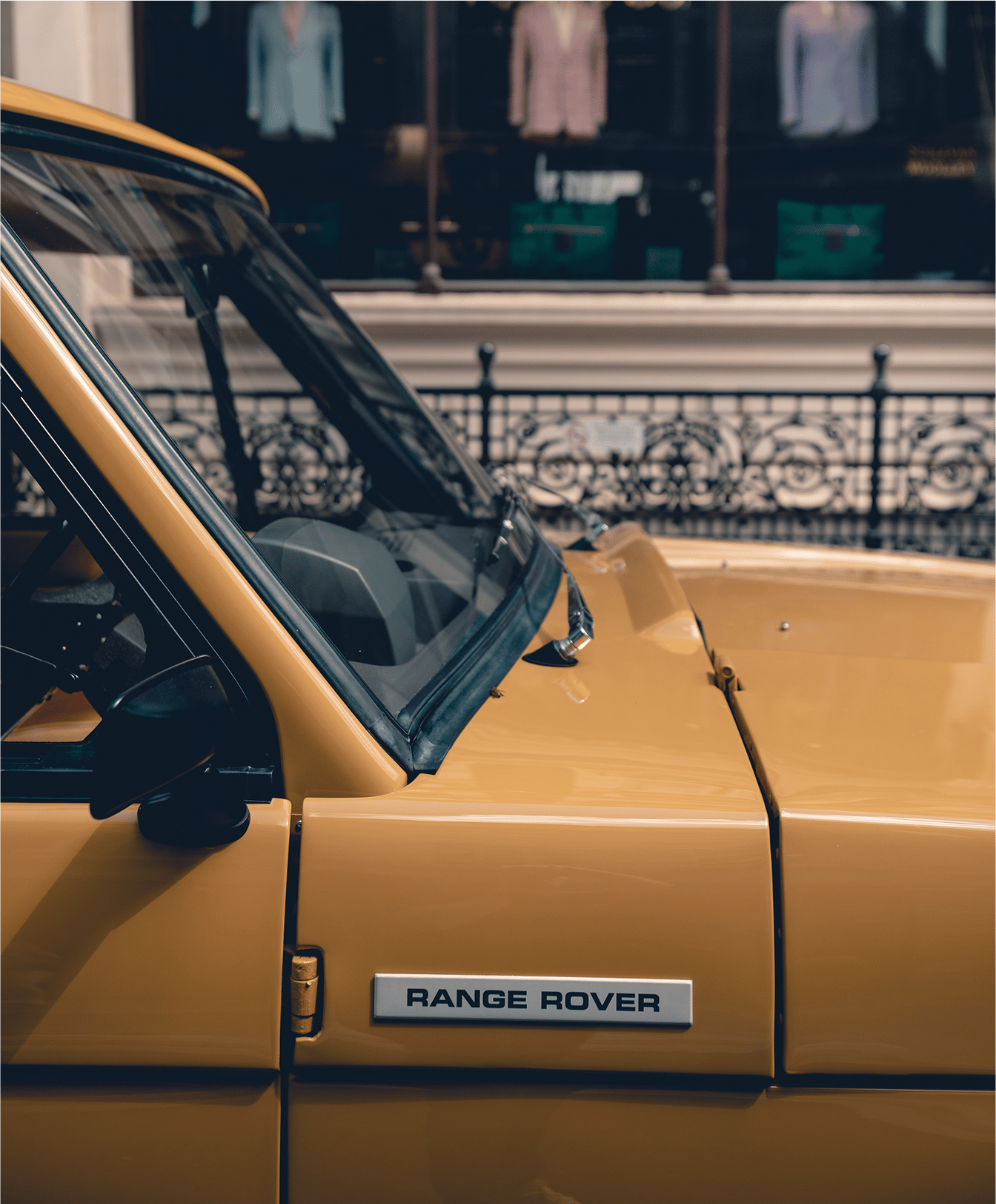
Range Rover didn’t change. It simply caught up with itself. And in doing so, it delivered a quiet masterclass in brand maturity.
For the design-minded, it’s a case study in precision. For the marketing crowd, it’s a model of strategic evolution. And for every founder or brand operator watching closely, it’s a reminder that sometimes, the smartest move is not to shout at all – but to sharpen the system and let the symbol do the talking.
Shot of the good stuff


