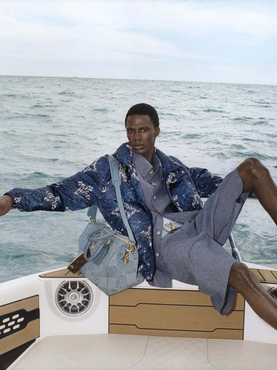
Louis Vuitton just gave its monogram a new life. Led by Hugo Michaudel, Head of Graphic Design for Men’s Leathergoods, the refresh moves the iconic LV print into more playful, illustrative world. Swimmers tangled in waves. Jungle scapes. Sailboats dotted across leather like postcards. It’s bold, clean, and leans hard into visual storytelling.
Across the Sport Capsule, Prefall 25, and SS26 collections, there’s a clear desire to loosen the monogram’s grip on formality and let it breathe. It appears LV are dialling in a sense of graphic personality. Each scene adds movement to the grid and each pattern feels like it’s trying to say something new, even while grounded in one of the most recognisable prints in fashion history.
And we’re fans.


From a brand perspective, this is the kind of world-building play we keep an eye on as brand led creatives. LV knows exactly when to go classic and when to push a little further. The recent campaigns around Pharrell’s creative direction have already brought a new vibration to the house. This monogram update feels like another verse in that same song.


But here’s where it gets interesting.
Some of the new graphic styles, especially the swimmers and golfers, demonstrate the visual language of Werner Brogkhorts, a name well known in design circles for his collage-like, organic compositions. The sense of human movement within stillness. It all feels… familiar.
In today’s creative economy, where references move faster than ever, influence is often unspoken. But when a house like Louis Vuitton chooses to evolve a pillar of its identity and that evolution looks like work already living in the design ecosystem, it’s worth holding space for both admiration and awareness.
Maybe that’s the point?
High fashion doesn’t exist in a vacuum. And the strongest ideas are usually the ones floating just beneath the surface of culture, waiting to be crystallised by the right platform.


Shot of the good stuff

