New York’s subway is one of the most influential pieces of graphic design in modern culture. Hailed not just for moving millions across the city each day, but for the fonts, lines, symbols, maps, and colour systems that defined it. Its aesthetic didn’t just help people navigate a city, it shaped how a city understood itself.


The Beginnings of Order
By the middle of the 20th century, New York’s subway had grown into one of the most complex transit systems in the world. It was massive, successful, and essential, but also visually incoherent. The system had been built by three separate private companies and later unified under the city, yet it never behaved like a single network. Different colours, different signage, different maps. To the casual rider it felt like the city had three subways sharing the same tunnels.
This created a specific kind of chaos. One observer in 1957 remarked that the system had reached a point where “only an expert can find his way around it”. The infrastructure worked, but the interface didn’t.
By the 1960s, the Transit Authority began exploring how to make the subway legible. Designers and planners started rethinking how riders could understand the network: reassigning colours, simplifying line structures, and experimenting with cleaner maps. Raleigh D’Adamo, one of the early advocates for reform, pushed for abandoning the old three-colour model entirely - not for aesthetic reasons, but because it no longer reflected the reality of the system.
The subway needed not just a new map, but a unified graphic identity.

Unimark and the Vignelli Intervention
That idea took shape with Unimark International, led by Massimo Vignelli and Bob Noorda. When the Transit Authority hired the firm in the late 1960s, the brief wasn’t simply to draw a map. It was to redesign how the subway communicated. Unimark approached the project with modernist precision: if the system was complex, then the rider’s experience needed to be simple.
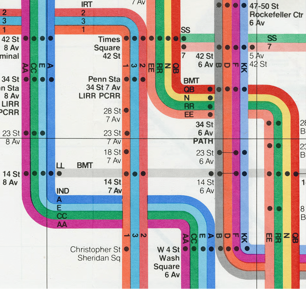
When the new map debuted in 1972, it looked less like a picture of the city and more like a circuit diagram. Geography gave way to geometry. Parks became coloured rectangles, water became negative space, and lines snapped into angles and grids. What mattered was not where the subway was, but how one moved through it. Vignelli put it plainly: “You want to go from Point A to Point B, period.”


Passengers didn’t all appreciate the abstraction. The New York Times praised the logic of the new map while also noting that it made Manhattan feel compressed and distorted. The complaints grew until 1979, when it was replaced by a more geographic map.
But the impact had already happened. Vignelli hadn’t just updated the map; he had reframed the subway as an information design problem - a shift that continues to define the system today.

What Designers Saw
For designers, the Vignelli map became iconic, not because it lasted, but because it articulated a principle: that information design is a cultural force. Its minimal colour palette, Helvetica signage, rational geometry, and strict use of hierarchy became the foundation of New York’s visual identity underground. Even today, much of the signage system owes its lineage to that moment. In time, the map came to be celebrated more than it was used - collected in museums, reprinted in books, and taught in design programs around the world.
The Aesthetic Beyond Transit
What’s striking is how easily the subway’s aesthetic moved beyond its original purpose. The visual system of the New York subway - the typography, the colour coding, the symbols, the language of navigational grids - became part of the city’s cultural imagination. It’s utilitarian but cool, institutional yet somehow stylish. You can print it on a tote bag or run it as a runway backdrop and it feels both grounded in the city’s machinery and aspirational in its graphic purity.
Fashion, of course, noticed.

Fashion Underground
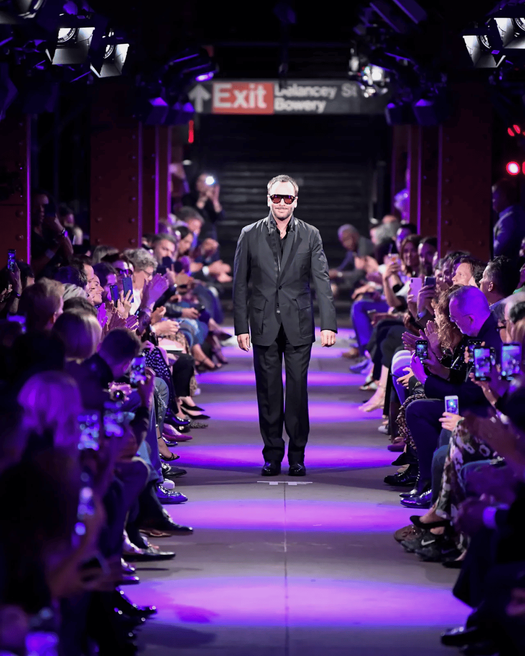
In September 2019, Tom Ford staged his Spring/Summer 2020 runway show in a vacant subway station in lower Manhattan. Models walked through tracks and platforms as if passing through a portal between the functional and the glamorous. The subway’s graphic identity played against the inherent luxury of Ford’s world, creating a tension New York understands better than any other city.
A few months later, Moschino held a pre-fall 2020 show inside the New York Transit Museum itself, with models walking through vintage subway cars - a full embrace of the system as both historical artefact and fashion set. The references were obvious but powerful: the subway as stage, the city as mood, the graphic language as connective tissue between them.
What both shows understood is that the subway isn’t just infrastructure. It’s a cultural symbol, a kind of aesthetic shorthand for New York’s energy, complexity, and glamour-in-grime duality. And crucially it’s legible. Graphic systems make meaning portable.

Streetwear Takes the Controls
Fast forward to 2025 and Corteiz executed what may be the purest expression of the subway as cultural object: a takeover. Their NYC pop-up transformed the Delancey station into a limited-edition retail activation, drawing thousands and turning a day of commerce into a moment of hype and spectacle. For a brand built on scarcity, mobility, and insider access, the subway provided perfect metaphorical alignment: only those who knew would arrive, and those who arrived would get the goods.
The Corteiz activation demonstrated how powerful the subway is as a contemporary cultural interface.

What makes the New York subway one of the great graphic design landmarks isn’t simply the map or the typography or the signage. It’s the fact that these things have become part of the collective imagination of a city. They allow millions of people to navigate both physically and symbolically. They offer designers a visual language and brands a readymade icon. They turn infrastructure into culture.
A city is defined by what it shares, and in New York, nothing is more shared than the subway.
Shot of the good stuff.


