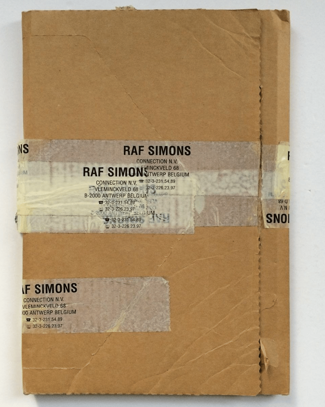
Scroll through any design curation platform and you’ll notice a recurring style: small text, angular grids, tiny icons packed tightly together. From Nissan’s industrial graphics to Raf Simon’s labels, this aesthetic has become commonplace across design, fashion, homeware, and almost anything else with a label.
These tiny schematic visuals can feel chaotic, yet there’s an order in their structure. There is just something about them that we feel so incredibly drawn to. They are systems of information, condensed into forms that feel both functional and beautiful.


The roots of this taste for clarity stretch back to the industrial revolution. As technology advanced in the 19th century, there was a cultural push for clean, modern aesthetics. Sans serif typefaces were adopted heavily, and their simplicity and legibility made them perfect for advertising, signage, and display typography.
By the mid-20th century designers like Josef Müller-Brockmann, Armin Hofmann, and Wim Crouwel were cementing the modernist grid-based style. Typefaces such as Akzidenz-Grotesk, Franklin Gothic, and Helvetica became the backbone of this approach, influencing everything from posters to packaging.


Legislation required that labels list care instructions, product origins, and material composition. Most companies weren’t thinking about aesthetics when adding this information, but unintentionally, they created a new visual language.
Decades later, these overlooked details have resurfaced on platforms like Are.na, endlessly collected and shared as design references. In hindsight, those functional little labels were laying the foundations for a micro-graphic aesthetic.

In recent years, the likes of designers such as Virgil Abloh, brands such as Maison Margiela, turned micro-graphics into deliberate decoration. Once purely functional, these compressed systems of type and iconography became aesthetic amplifiers, lending products a sense of technical depth and hidden narrative.
In my own work, they’ve become a common request - clients asking for branding that incorporates micro-graphics not as an afterthought, but as a defining element.

One studio that embodies these principles is the Munich-based practice Daily Dialogue. Their work is functional yet elegant, blending typefaces and graphic structures into identities that feel as much like exhibition pieces as they do brands.
A clear example is their collaboration with CAP Agency, where stationery and collateral moved from supporting assets to the very forefront of the identity.


What makes micro-graphics compelling, though, is their sense of purpose. They only work when the small elements add meaning, whether it’s educating a customer through a discreet care label, or embedding a brand’s philosophy inside the underside of a product.
At their best, they bring clarity to dense information, arranging it in a way that feels intentional and beautiful.
But in some cases, they’ve also drifted into pure art, where designers experiment with repetition, proportion, and alignment for no practical reason at all. That’s part of the fun.
Push the boundaries, treat them as visual experiments, and maybe one day your micro-graphics will end up on someone’s moodboard in 2080.
Shot of the good stuff


