

For as long as brands have existed, labels have quietly been telling stories of their own, a subtle supplement to a garment, object or product. Small and often overlooked micro-graphics, they sit at the intersection of function and expression. A label can signal quality, attitude or humour in a single glance, becoming the first moment of connection between brand and wearer. This is a look at labels and hang tags not as afterthoughts, but as miniature canvases for identity, craft and playfulness.


In the early 1900s, garment labels were as simple as possible. Elegant script and minimal typography communicated little more than a brand name and size, reflecting the visual language of the era. Through the 1930s and 40s, union labels such as those from the NRA and the International Ladies’ Garment Workers’ Union (ILGWU) not only dated garments but became design artefacts in their own right, helping collectors trace pieces back to specific periods. By the 1950s and 60s, labels began to expand beyond identification, incorporating fabric content and care instructions as textile technology and consumer expectations evolved.
As fashion accelerated in the post-war boom, labels started to mirror wider cultural shifts. The bold, expressive energy of the 70s and 80s saw labels transform into status markers, as houses like Yves Saint Laurent, Givenchy and Gucci treated label design as a visual signature. These small graphics spoke as loudly as the garments themselves, becoming emblems of identity, aspiration and era.


Alongside woven labels, hang tags began their own evolution. What started in the 19th century as plain paper identifiers, gradually became a brand’s first physical touchpoint on the shop floor. Simple card gave way to crafted finishes, typographic experimentation and playful details that communicated personality before a shopper even felt the fabric.


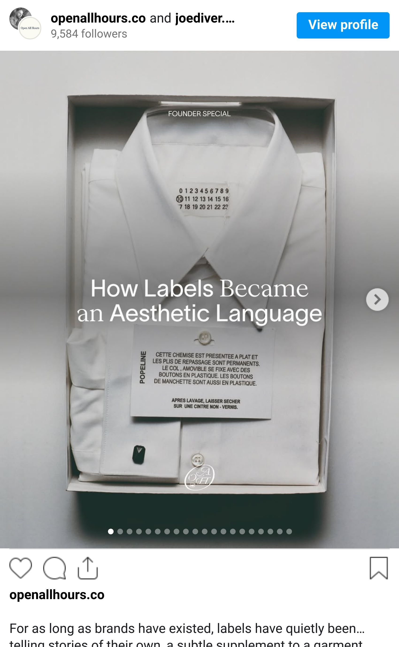
Maison Margiela offers one of the most conceptually rigorous approaches to labels in fashion, treating them not as branding devices but as philosophical statements. Founded in 1988 by Martin Margiela, the house built its identity around anonymity and discretion, from the designer’s refusal to be interviewed to runway shows where models’ faces were obscured so focus remained on the clothes. This ethos is most clearly expressed through Margiela’s labels: blank white tags held in place by four loose stitches, designed to be removed entirely, leaving the garment deliberately unidentifiable.
In 1997, this idea evolved into the numbered label system, where a single circled number quietly denotes the line a piece belongs to. Rather than shouting authorship, Margiela’s labels reward knowledge and curiosity, turning the smallest detail into a coded expression of values, craft and anti-logo luxury.

Jump to the present and a brand that comes to mind is AELIZA, a Brixton-based label founded by Jack Harper, with an ethos rooted in empathy and the creation of quiet spaces where people can be themselves. What stands out about AELIZA is its use of smaller, often overlooked applications, labels, keychains and event announcements, as a primary medium for communicating ideas and intent. The typography is minimal and structured, used less for decoration and more as a vehicle for thought.
To me, this reflects a quieter approach to brand building. It’s not fast-paced or attention-grabbing. The brand doesn’t shout its ideas, instead leaving space for the individual to be inquisitive and engage on their own terms. Labels and small-scale applications offer a natural place for this kind of dialogue.

Shot of the good stuff.
