Opening Pour
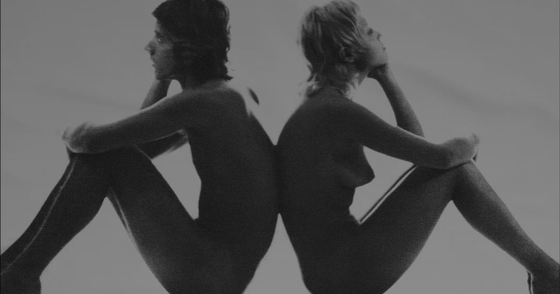
Some identities are engineered with precision and some simply arrive by accident. The Kappa logo belongs to the latter, born not from a brainstorm or a brief, but from a moment between shutter. A pause. Two bodies resting back to back. A silhouette that was never meant to be seen, let alone become one of the most recognisable marks in global sport and street culture.
Kappa’s Omini logo is a reminder that design history is not always linear. Sometimes the most lasting symbols start in the margins and the frames nobody planned for. That’s where this story begins.
Blend Origins: The Photograph That Changed Everything
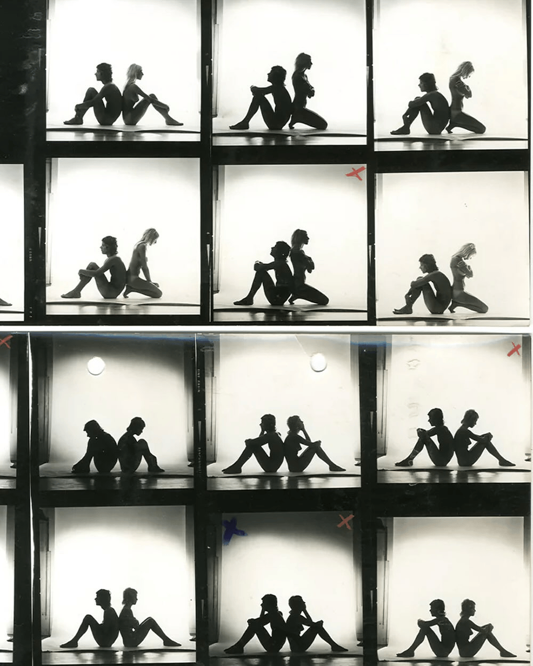
In 1969 Kappa shot a Beatrix Swimwear campaign with photographer Sergio Druetto where he captured a naked male and female model sitting back to back during a break between shots. It was unposed and unpolished. A moment of rest in between ‘the campaign’.
When the film came back, this single frame stood out to the team. Strong lines. Perfect symmetry. A masculine and feminine balance in a single gesture. That is not easy to achieve.
Kappa’s leadership recognised something in the image. Not sensuality, which would have been easy. Something cleaner and more human. A blend of unity, duality and human connection. It was stripped of detail, but full of meaning.
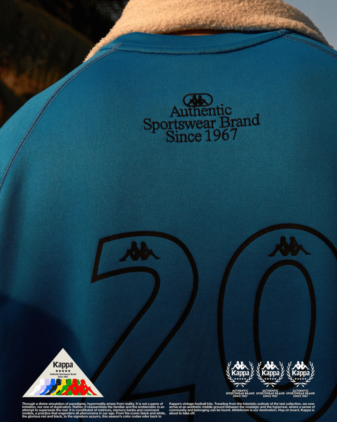
That silhouette became the Omini mark. Unlike the swooshes and stripes emerging in global sport at the time, the Omini mark was figurative. Two people, equal in posture and scale. It signalled a different kind of sportswear identity. Less about performance alone, more about the individuals who wore it.

The Seventies Shift: When Kappa Became Culture
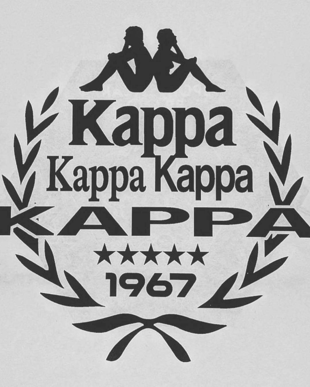
Through the seventies and eighties, Kappa leaned fully into the Omini mark. They took a logo born from intimacy and scaled it up into a repeating pattern that wrapped around tracksuits, jackets, and sideline gear. The duotone silhouette stretched down sleeves and legs, creating one of the most distinctive brand systems in European sport.
This is where the mark evolved from symbol to language. Logos normally sit on the chest. Kappa turned theirs into a stripe. Repetition became style. It was an early understanding of how a brand could behave across a garment, not simply on top of one.
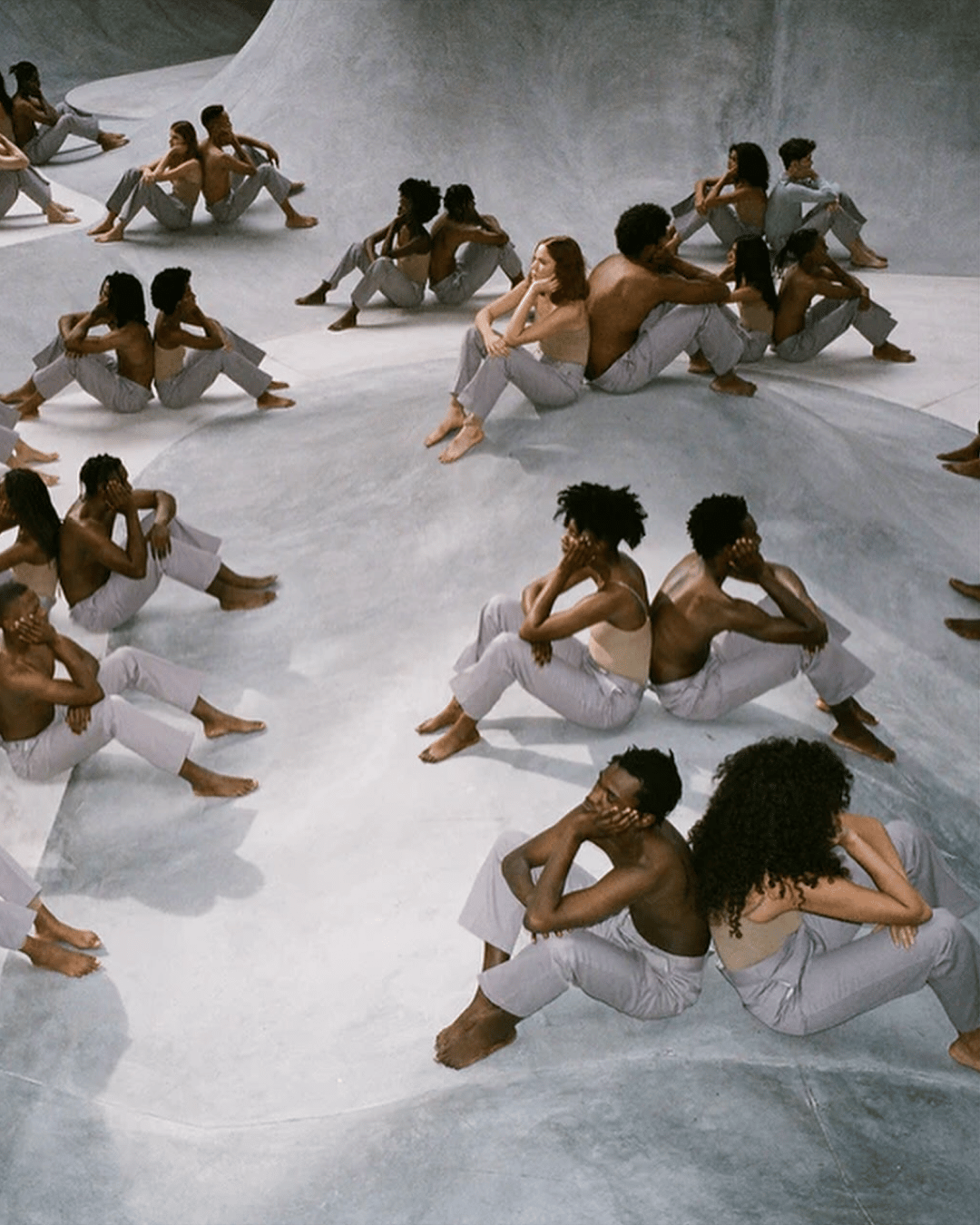
Football adopted it first. Then athletics. Then the terraces. By the nineties, the Omini had travelled far beyond kits. It arrived in streetwear before streetwear had a name. Hip hop, Italian youth culture, and British nightlife all absorbed the mark and pulled it into their own worlds.
A mistake had become a movement.
Modern Minimalism Meets Italian Attitude
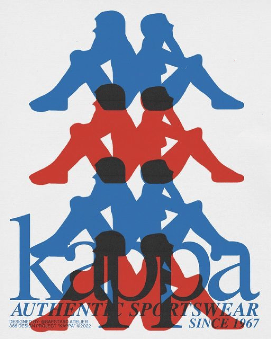
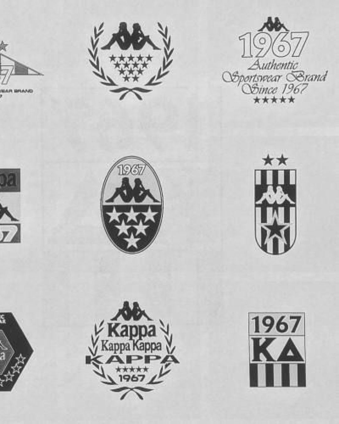
What makes the Omini logo endure is its simplicity. Two curved forms. Negative space that does half the work. A silhouette that reads instantly at any scale. It contains a softness rare in sports branding, yet a sharpness that makes it unmistakable.
While other brands leaned harder into futurism and performance graphics, Kappa stayed human. Quite literally. That was the advantage. The enduring power of the Omini comes from the fact that it represents people, not products.
It served as a foundation for everything that followed. The heritage tracksuits. The football kits that became cult pieces. The collaborations with designers, musicians, and fashion houses.
Every interpretation still points back to those two figures sitting back to back, in a moment that should have disappeared on contact sheets.
Cultural Return
In the last decade, Kappa has experienced a resurgence. The Omini logo sits comfortably within the new European sportswear sensibility, where nostalgia and modernism intersect. It’s heritage without feeling trapped in the past.
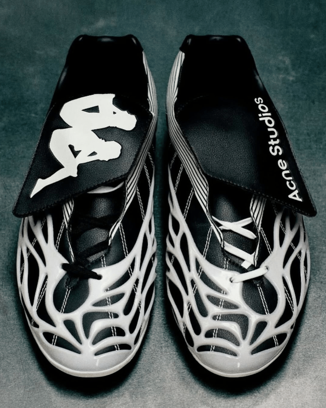
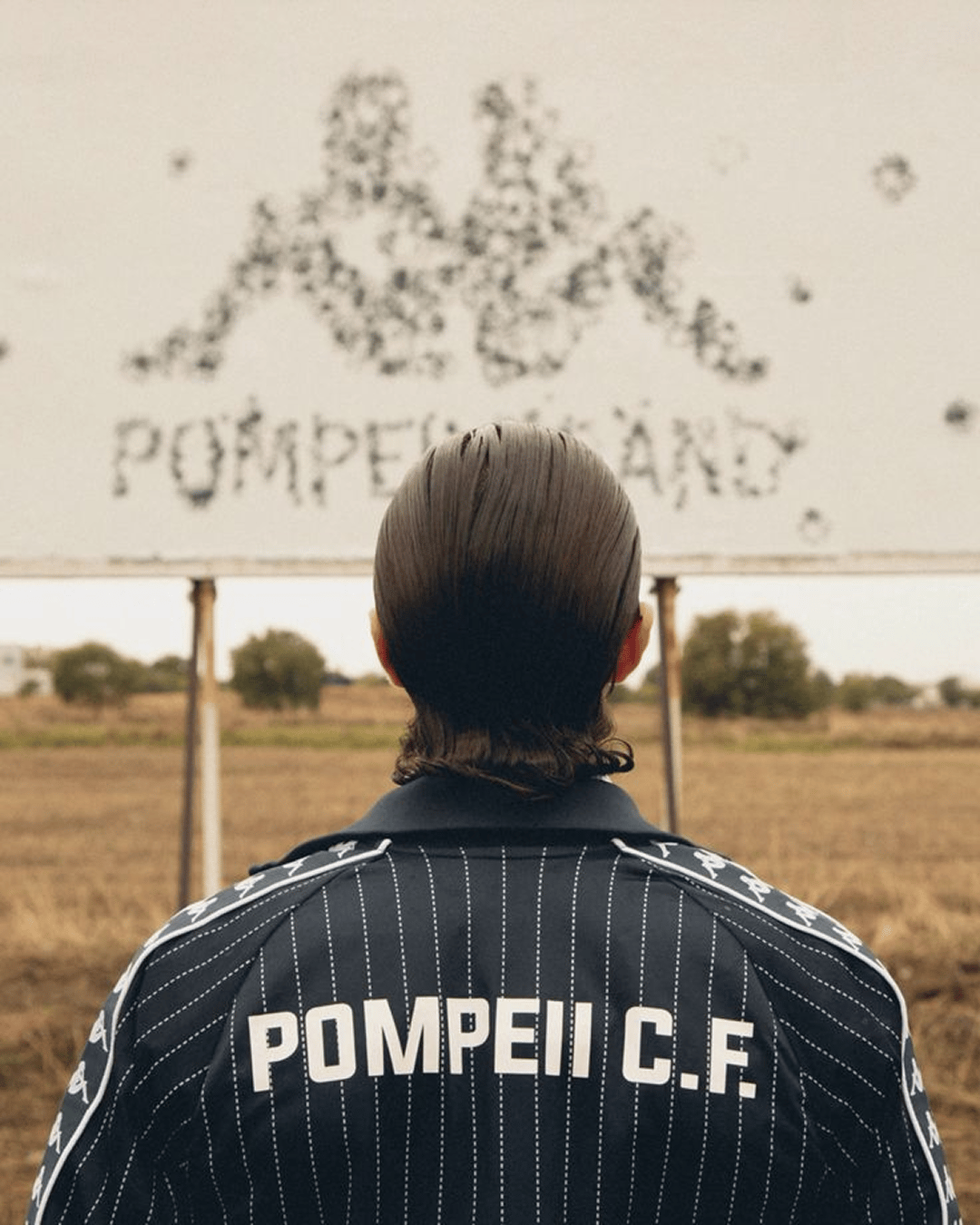
Recent collaborations have brought the logo into new contexts. High fashion. Street-led capsules. Football collectives. Designer-led limited editions. The mark adapts, stretches, repeats, rearranges itself, and remains whole. That flexibility is what makes it a design system, not just a logo.
A Mark That Continues to Move
The true test of a logo is longevity. Not through decades alone, but through relevance.
The Omini silhouette remains one of the clearest symbols of unity in sportswear, and one of the most visually distinctive brand codes in European sports design.
It’s proof that identity does not need to be engineered to perfection. It needs to mean something. It needs to hold memory and feel alive.
Aftertaste
The Kappa logo started as an accident, yet became a symbol recognised across continents. That is the power of design when it captures truth rather than invention. Two silhouettes. One identity.
A reminder that sometimes the best ideas arrive when nobody is trying too hard.
Shot of the good stuff


