
There’s something in the air this week. Not a story. Not a trend. A temperature. A shift in mood driven by colour and the way it behaves when you let it speak before anything else.
Some colours arrive loud. They take the room before you do. Represent pink. The green that sits somewhere between matcha and seawater. Neon wash drifting across a face in a city that never really sleeps.
These shades do not wait for permission. They tell you what the scene is about without needing context.
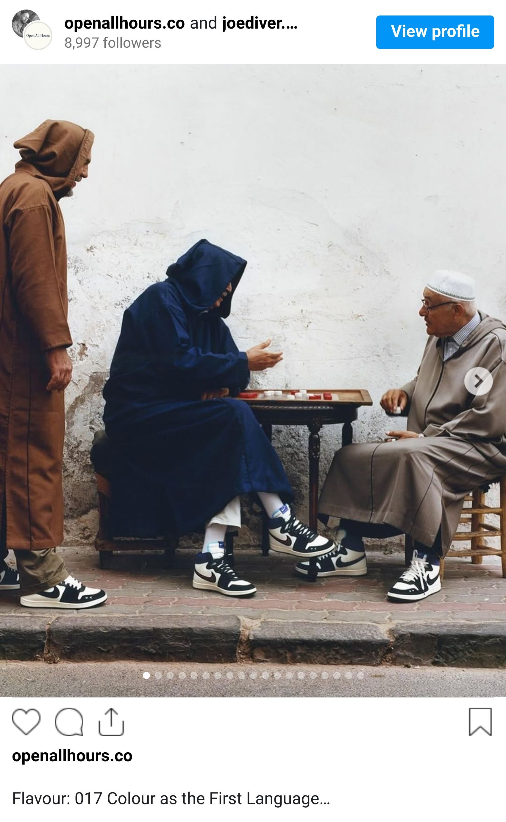
Powdered neutrals. Soft greys on concrete. The washed denim blues that frame two bodies moving in sync. The warmth in an old print. These are the colours that give space. They hold narrative.
This flavour is about both.
Because colour can sharpen a story or soften it. It can provoke or soothe. It can make something ordinary feel designed. Designers know this, but sometimes we forget just how much colour is doing the heavy lifting.
Look at the palette across this week’s board. You can see how colour directs behaviour.
How it moves your eye with intention.
How it defines the emotional temperature of a moment.


The deep cinematic shadows of a parked car feel tense. The sun-beaten tones of a lazy afternoon with two Coke bottles feel nostalgic in a way no caption could ever recreate.
Colour builds memory. It shapes the energy of a brand long before the logo has shown up. It’s the part of design that hits the senses.
This week reminded us that colour is not decoration. It is direction.
Every image in this mix carries its own intention. In the house we talk a lot about taste. Colour is the purest expression of it.
Treat it like language, like architecture.
Treat it like the first feeling someone gets before theyknow anything else about your work.
Flavour is always about mood.
This one is about owning the one you create.


Shot of the good stuff.
