
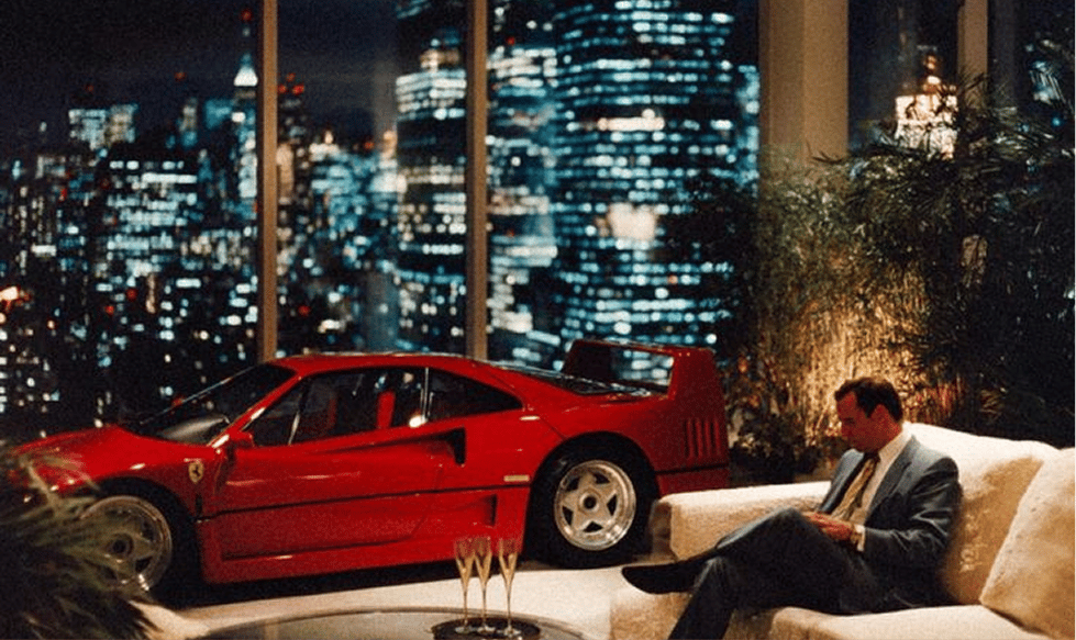
Ferrari is one of the few brands where the symbol arrives before the system that surrounds it. Long before people talk about engine notes or lap times, they talk about the horse, the red, the idea of Italy expressed through speed and obsession.
That's why Ferrari works so well as an Identity Room study. This is not a brand that uses design to dress performance. Design exists to protect belief. Every visual decision exists to make the myth feel continuous, even as decades pass and technology changes.
From the very beginning, Ferrari's identity has carried something cinematic. A racing driver. A black horse on a yellow field. A small Italian city that somehow became global shorthand for excellence. The identity has always balanced specificity and universality, and that tension is where its power lives.
The horse that became a character
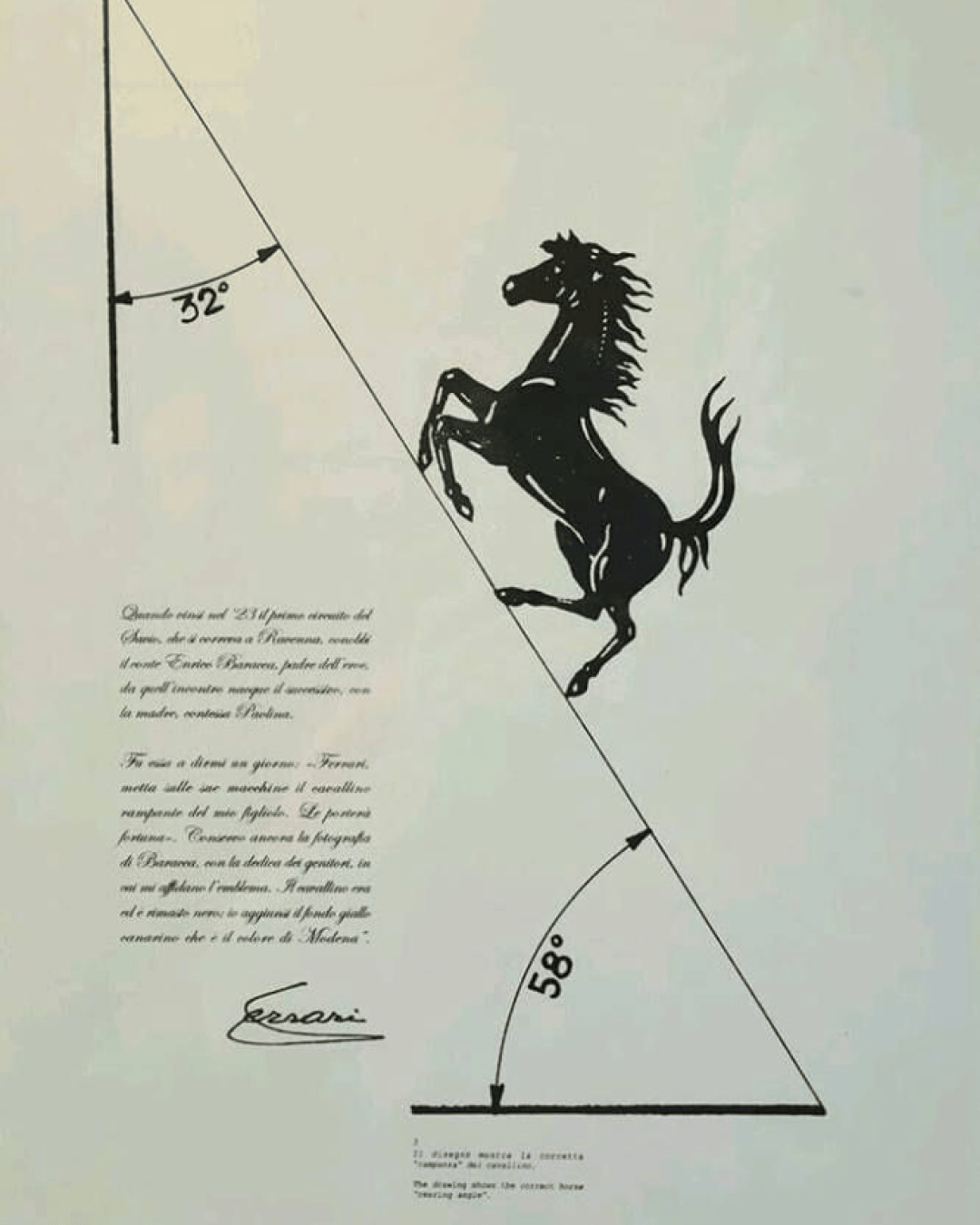
The Prancing Horse is not a neutral graphic. It is a character with a backstory, and that matters more than any formal analysis of line weight or silhouette.
The emblem's origin, tied to Francesco Baracca and adopted by Enzo Ferrari in the early years of Scuderia Ferrari, gave the mark emotional gravity before it ever became corporate. It was framed as a symbol of luck, bravery, and continuation. That framing stuck. People do not simply recognise the horse.
Visually, the horse is stylised rather than literal. It feels mythical. That choice allows it to transcend time. It does not belong to a specific era of illustration, which is why it still reads as relevant today.
Yellow as birthplace
Ferrari yellow is often treated as secondary in casual conversations about the brand. In reality, it is structural.
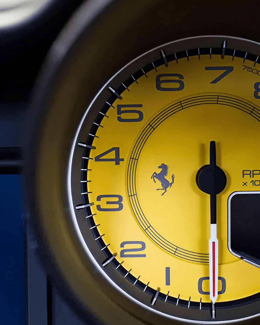
The yellow field behind the horse is directly tied to Modena, Ferrari's home. That connection turns colour into geography. The yellow does not exist to decorate red. It exists to anchor the brand in place.
Design wise, this is a powerful move. Yellow carries history. It allows Ferrari to travel globally while remaining unmistakably local. Many brands attempt this through storytelling. Ferrari does it through a background colour.

Red becomes cultural property
If yellow is birthplace, red is behaviour.
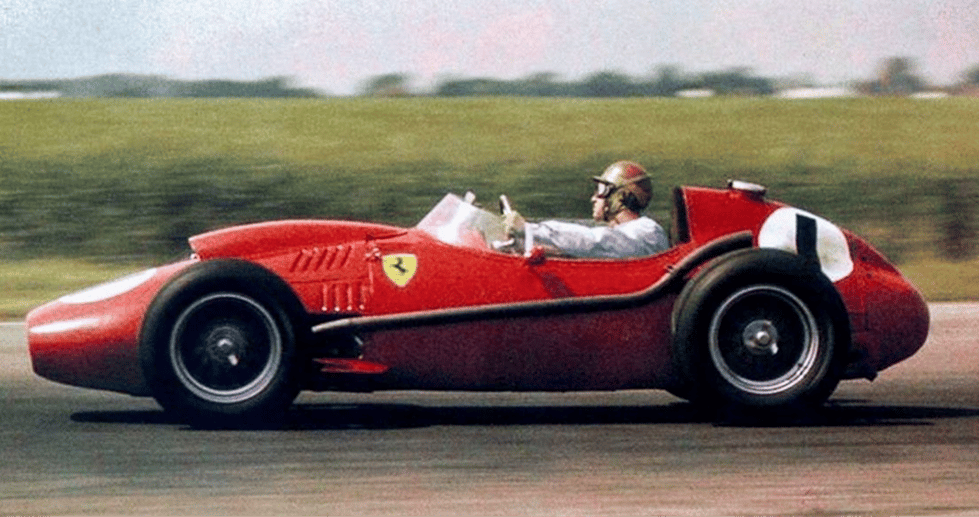
Rosso corsa began as Italy's racing colour rather than Ferrari's invention. Over time, Ferrari became so closely associated with it that the colour and the brand fused in public. That fusion is one of the clearest examples of cultural ownership in branding.
What's important here is that Ferrari has never fully frozen red into a single, rigid specification in the way many modern brands do. Shades have shifted subtly across eras, cars, and materials. The power of the colour comes from repetition and meaning rather than perfect consistency.
Red, in Ferrari's world, signals intent. It promises performance, emotion, and ambition. Even when Ferrari steps away from red in product or lifestyle contexts, the colour remains present.
The wordmark and the weight of engineering
Ferrari's wordmark does a quiet but critical job. It balances machinery with elegance.
The slab serif construction gives the name stability. It feels engineered rather than decorative. There is a sense of permanence in the letterforms, as if the name itself has been machined rather than drawn.
At the same time, the wordmark carries a distinctly Italian swag. Not in a romantic or nostalgic way, but in a craft driven way. It feels like something made by people who care deeply about precision and finish.
This balance allows Ferrari to exist comfortably in both motorsport and luxury. The name can sit on a race car or a fashion garment without feeling out of place.

From emblem to system
What Ferrari has refined over time is not the core assets, but the system around them.
The brand operates with two primary emblem behaviours. The shield is closely tied to racing and heritage. It carries the tricolour band, the yellow field, and the horse in its most ceremonial form. The rectangular mark and standalone wordmark extend the identity into corporate, product, and lifestyle environments.
This separation allows Ferrari to move between worlds. Motorsport remains sacred. Everything else inherits the authority without diluting it.
Typography enters the modern era
For much of its history, Ferrari did not need a modern type system. The emblem and wordmark did enough work on their own.
That changed as digital communication, Formula One broadcast clarity, and global merchandising demanded more functional typography. Ferrari's introduction of Ferrari Sans, particularly visible in Formula One contexts like car numbers and official communications, is a significant moment.
Ferrari Sans is clean, controlled, and built for legibility at speed and distance. It does not attempt to replace the heritage wordmark. It supports it. This creates a two voice system that many heritage brands struggle to achieve.
The old voice carries myth. The new voice carries the future.

Space, hierarchy, and confidence
One of Ferrari's most consistent identity behaviours is how much space it gives itself.
The shield is rarely crowded. The wordmark is often allowed to stand alone. Layouts favour clear hierarchy over complexity. This creates a sense of authority that does not rely on visual density.
In physical environments like Maranello, dealerships, and exhibitions, this feels intentional. The brand does not need to say anything because recognition is assumed.

Motorsport versus luxury, without contradiction
Ferrari's identity has to operate in two very different emotional environments.
Motorsport is loud, tribal, and charged. Luxury is composed, and controlled. Many brands fail when they try to span both.
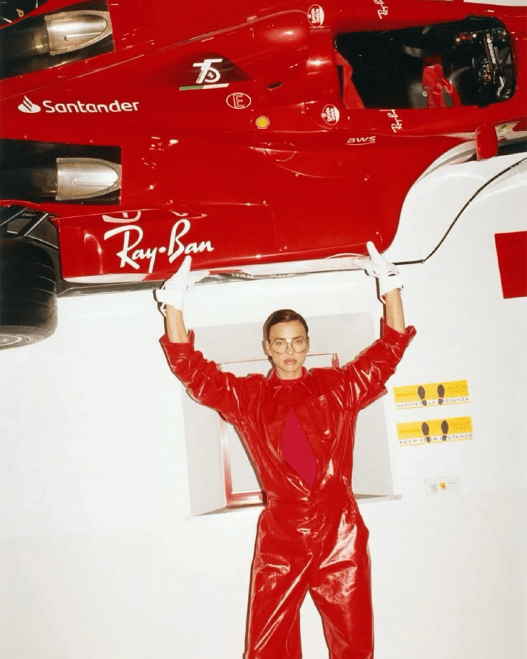
Ferrari succeeds because the core symbols are strong enough to absorb context. The same horse can feel aggressive on a Formula One car and elegant on a leather jacket. The same colours can signal competition or status depending on how they are applied.
This adaptability is not accidental. It comes from decades of disciplined behaviour.
What the identity signals culturally
Ferrari communicates without apology. It behaves like a brand that knows its place in history and does not need to chase relevance.
Culturally, it speaks to two overlapping audiences. The tifosi, who see the shield as belonging. And the global luxury audience, who see it as aspiration. Both read the same symbols and feel included for different reasons.
Ferrari also represents a rare case where national identity becomes global desire. Italy is present everywhere in the system, but never as a cliché.

How it makes people feel
Ferrari's identity consistently evokes desire, belonging, and awe.
Desire for an object, but also for a way of life. Belonging to a tribe that values excellence and passion. Awe at something that feels larger than any single product cycle.
Even for people who will never own a Ferrari, the identity can still feel personal. That emotional proximity is part of the brand's cultural dominance.
Shot of the good stuff.

