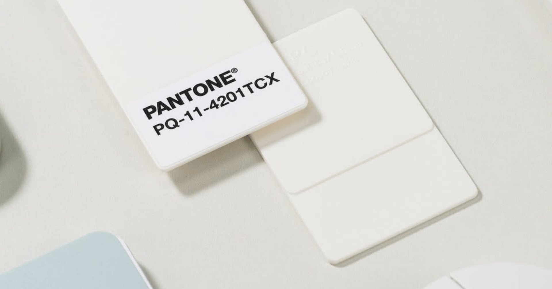
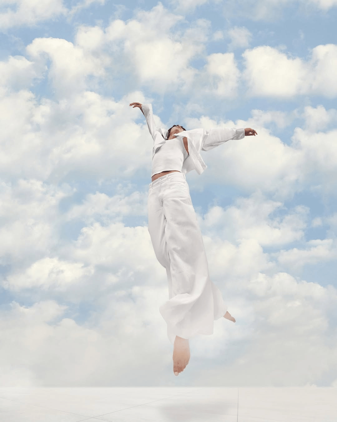
Pantone has revealed its rather controversial Colour of the Year for 2026: Cloud Dancer. That’s PANTONE 11-4201 to be precise. Pantone describes it as “a lofty white neutral whose aerated presence acts as a whisper of calm and peace in a noisy world.”
Naturally, choosing a colour as clean and understated as this invites debate. Is it an insult to colour theorists, designers, and artists, or is it exactly the cleanse we need in a time defined by information overload and ever-growing demands on our attention?
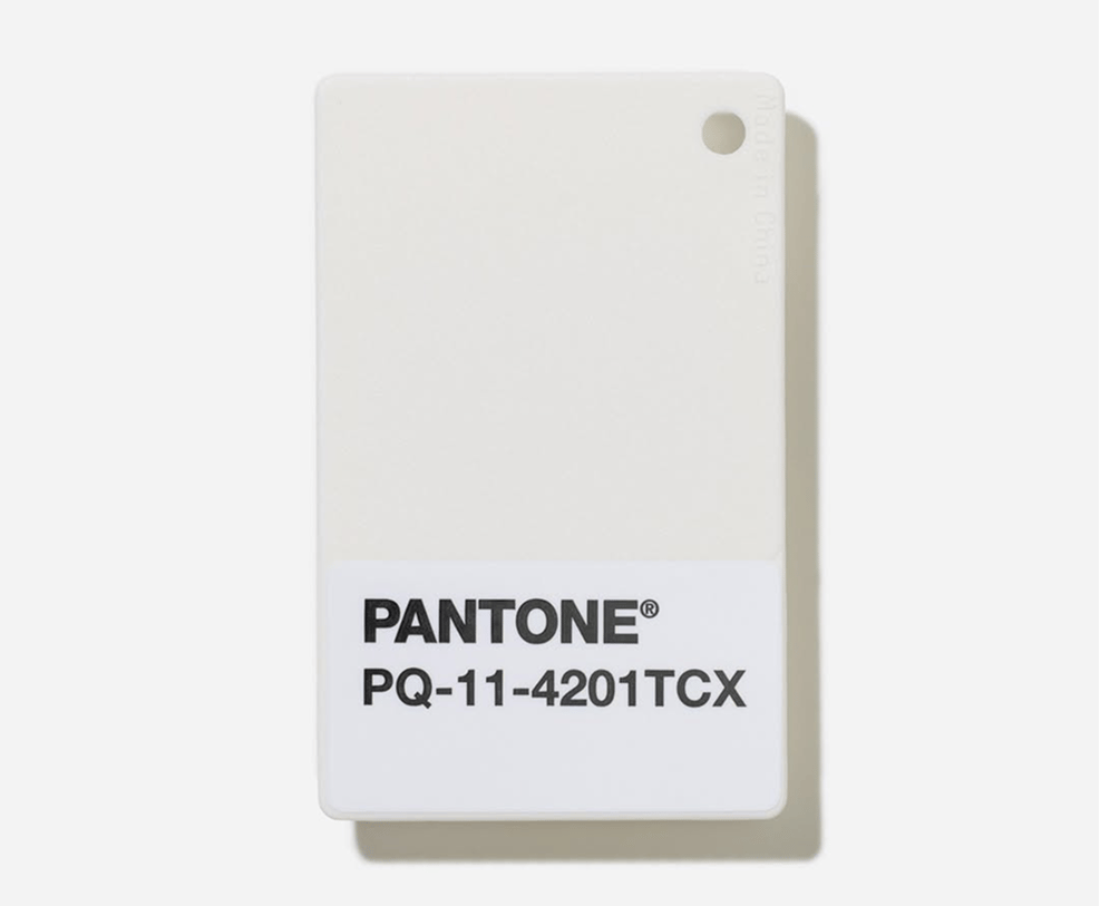
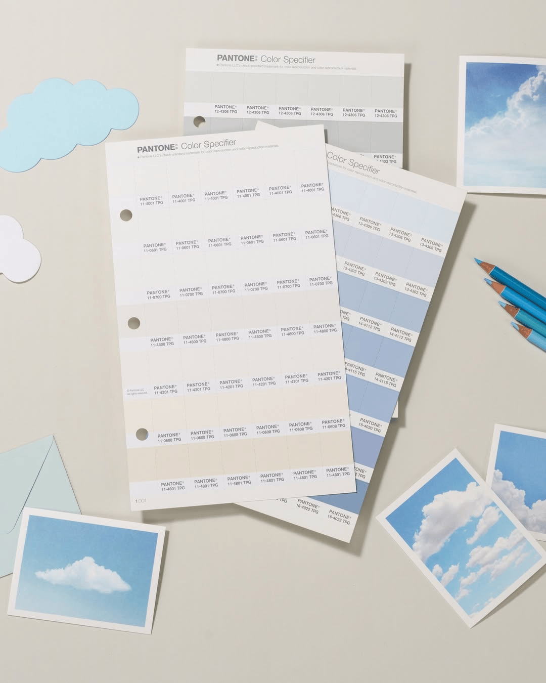
Pantone positions Cloud Dancer as a foundational shade, a colour that provides “scaffolding for the spectrum, allowing all colours to shine.” And in many creative disciplines, white truly does play this role. It is the canvas that allows other elements to take centre stage. In interior design it creates space. In digital design it lets photography, typography, and storytelling breathe. White supports rather than shouts. Its contrast without competition.
For minimalists, Cloud Dancer feels like a breath of fresh air. But as maximalist aesthetics continue to grow in fashion, graphics, set design, and culture at large, the choice does feel contrary to the moment. Still, Cloud Dancer does not necessarily signal a push toward minimalism. It might instead represent an invitation for more creative experimentation. When the base is simple, the possibilities can expand.
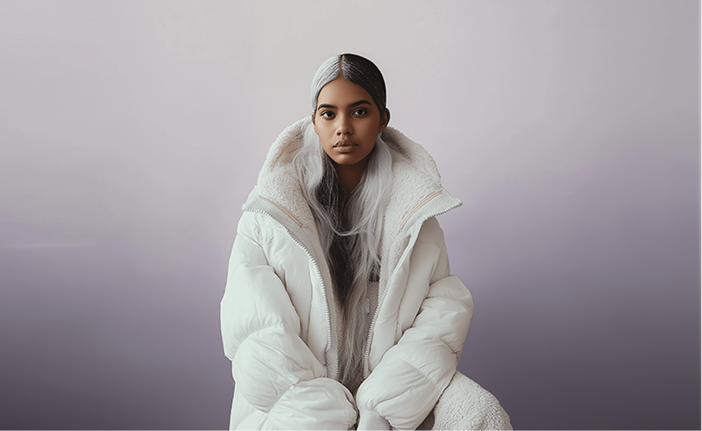
On the flipside, many creatives see Cloud Dancer as a sign of disconnect from the communities surrounding Pantone.
White is the absence of colour. Should the world’s leading colour authority have delivered something bolder? Something that captures cultural energy instead of retreating from it?
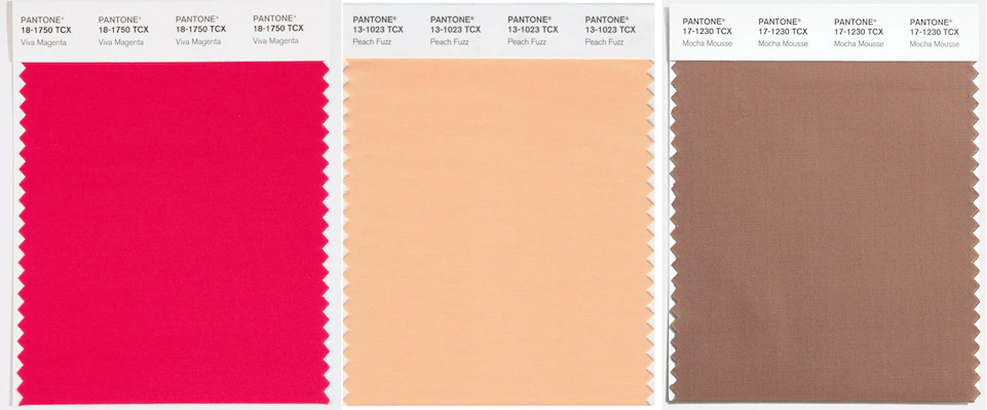
It is difficult not to compare this year’s pick with Pantone’s more vibrant choices from the past. Think of 2019’s Living Coral or 2012’s Tangerine Tango. These colours pushed into culture. They shaped trends. They communicated optimism and momentum. Cloud Dancer if anything, appears to step back.
So what does that mean for 2026?
Cloud Dancer may feel underwhelming at first glance, but that might be entirely the point. Design moves in cycles, and with condensed serif typography and Gen Z influenced maximalist branding currently dominating, this choice reads as a deliberate reset. Instead of prescribing a colour to steer the year, Pantone may be opening up space for wider creative expression to take the spotlight.
Whether you see Cloud Dancer as a thoughtful reflection of our time or a missed creative opportunity depends on what you believe colour should do. Should it guide culture, or provide a canvas for new ideas to take shape.
Shot of the good stuff

